Content gallery
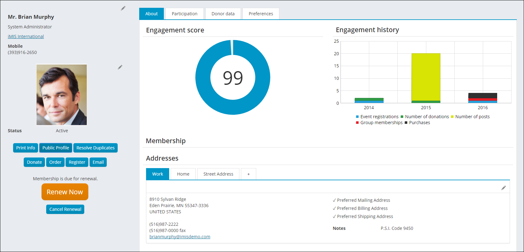
Big Button Panel
-
Description - With the Big Button Panel content item, you can display a navigation panel that combines a larger, category-defining image with a list of links.
 You can also use this content item to create links that make it easy for staff to perform routine tasks for contacts such as running reports, registering for events, and ordering on their behalf.
 - Usage Scenario - Working On Behalf Of contacts and running reports using the Big Button Panel.
Configuration options
- iPart CSS class - Enter the CSS class that will designs the button. Without a CSS class defined in this field, the content
-
Panel image - (optional) Enter the URL to an image to display within the panel. The URL can be absolute (http://example.com/myImage.jpg//example.com/myImage.jpg) or relative (~/images/myImage.jpg).
- Image alt text - (optional) If a Panel image is selected, enter a description for the image to be used as the alternative text.
-
Mode - Select a mode for the Big Button Panel:
- Navigation - Select this mode if you only want to offer a list of links. The options to filter by a URL Parameter and to trigger working On Behalf Of (OBO) someone are not available in Navigation mode.
- Actions - In this mode, links can also contain URL Parameters that use dynamic filters. For example, you can pass the ID for the selected contact to the target page, which you can then use in content items, or to run reports for the contact. An additional option is also available to trigger working On Behalf Of (OBO) someone.
- Open links in a pop-up - Select this option to open links clicked within the Big Button Panel in a pop-up window. This option is useful, for example, if you want to quickly run a report or view information about the selected contact.
-
Navigation item - (only available in Navigation mode) Select a navigation item for content to display within the panel.
- Include parent navigation item - Select this option to include the parent navigation item as a link.
- Child levels to display - If the navigation item selected has child navigation items within the sitemap, enter the number of levels to display. If you enter 0, all descendants are displayed. If you enter 1 or more, only that number of navigation levels is displayed.
- Limit users who can view data for other contacts - Select this option to hide the iPart if the user viewing the page does not have access to edit the selected content.
-
Additional links / Actions - Click Add, enter the link information, then Save to add links to display within the panel.
- Link Text - Enter the text to display for the link. If left blank, the text is automatically generated based on the title of the navigation item, content, or page title.
- Link Target - Enter the target of the link, which can include URLs, URL shortcuts, navigation paths, content paths, or navigation codes.
- URL Parameter - (only available in Actions mode) Add a URL parameter if the Link Target contains iParts or an SSRS report that can accept a URL parameter value as input. You can use dynamic variables in the URL parameter if needed. For example, if you are linking to a report that can filter results based on the value of a ContactKey URL parameter, enter ContactKey=@selecteduser, so that you can easily run the report for the currently selected user. You can use the following dynamic variables:
- Pass in ContactKey and UserKey properties:
- @LoggedInUser and @Me: Uses the currently logged in user.
- @SelectedUser and @SubjectContact: Uses the selected contact, such as contacts selected through a URL parameter or On Behalf Of.
- Pass in any existing URL parameter:
- @url:[ParameterName]: Passes the value of a give ParameterName in the existing URL. For example, use EventKey=@url:EventKey to pass the current URL's EventKey parameter to the link.
- Pass in ContactKey and UserKey properties:
- Use On Behalf Of - (only available in Actions mode) Select this option if you want to set the currently selected contact as the On-Behalf-Of contact.
Example: Creating a Big Button Panel
-
Do the following to create content using the Big Button Panel:
- Edit the account page that displays after a staff user selects a contact from your directory. In the Member site, it is the Account Page Staff content record.
- Add the Big Button Panel (add content > ContentTypes > Content > Big Button Panel) content item to the content record and configure it with the following settings:
- Mode: Actions
- Add an action link to run a report:
- Link Text: Print Info
- Link Target: Enter a link to a page that contains the SSRS Report content item that displays a report such as $/Samples/ReportingServices/MemberProfileQuery_Report.
- URL Parameter: ContactKey=@SelectedUser
📘 Note
The SSRS Report content item must be configured to Hide the parameters section and to enable the option to Inspect query string for parameters. Do not enable the option to Inspect Session for parameters. For more information about SSRS reports, see Creating SSRS Reports. - Add an action link for event registrations:
- Link Text: Register for an event
- Link Target: Enter a link to the event page
- URL Parameter: EventKey=XYZ (replace XYZ with an event code) EventKey=XYZ (replace XYZ with an event key), or use EventKey=@url:EventKey to use the event key from the URL parameter on the current page.
- Use On Behalf Of: Enable
📘 Note
Customize this text for the event you want to register the contact for. For example, Register for the Spring Conference. - Add an action link for donations:
- Link Text: Make a donation
- Link Target: Enter a link to your donation page
- URL Parameter: (Leave blank)
- Use On Behalf Of: Enable
- Add an action link for the shop:
- Link Text: Purchase a product
- Link Target: Enter a link to your Shop page
- URL Parameter: (Leave blank)
- Use On Behalf Of: Enable
- Save and Publish the account page.
Content Block
With the Content Block content item, you can empower authorized users to create and edit content directly on a page, without using Easy edit or accessing Tools. Through the configuration, you can allow users to insert HTML content, add attachments, create child pages, and submit replies. At its simplest, a content block can be HTML that is read-only unless the user has permissions to see the edit command. At its most complex, a block can act as a message board with multiple posts, child posts, and replies. You can limit the number of posts to a set number, or you can leave it at the default (zero), which lets it grow indefinitely.
Tagging to filter content
To control what content appears in a Content Block, you create tags specific to ContentBlock Items and apply those tags to specific instances of the content item. For example, if you want to create a new blog for Tim Jones, you could create a ContentBlock tag such as blog-JonesT, place a new Content Block content item on a content record, and configure the content item to display the tag blog-JonesT. Now the content that Tim authors in this blog will be unique to his+ blog, if you do not apply this tag anywhere else:
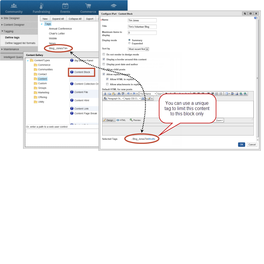
Content created with anything other than a Content Block content item will not be displayed, even if it has the same tag. For example, a content record containing HTML tagged with News will not show up in a Content Block that is also using the News tag.
📘 Note
Plan for and create the tags you want to use before configuring your Content Block content items. Content can seem to disappear if you change the tags assigned to a content block already in use, because it no longer matches the tag set currently configured.
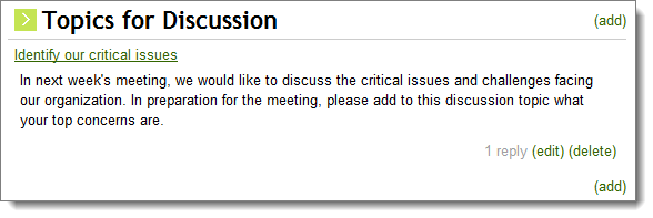
Creating a message board
Only users with the Content Editor permission may create posts and children, but any authenticated users can reply to a post and edit or delete their own replies.
To use the Content Block as a message board with multiple posts, child posts, and replies, make use of the following configuration options:
- Maximum items to display – Choose the maximum number of posts that will be displayed; 0 indicates an unlimited number of posts.
- Display mode – Expanded display mode will display replies and child posts in-line, while Summary mode only shows replies and child posts when the post is opened.
- Allow child posts – Allow Content Editors to add a child post to existing content.
- Allow replies to posts – Allow authenticated users to reply to posts; you may indicate whether to allow HTML and/or attachments in the replies.
Content Collection Organizer
The Content Collection Organizer content item enables users to create a collection of pages and assign names to the tabs or headers for each page. In the simplest example, those pages are displayed, the user can access tabs in any order desired, and information is saved independently on each page.
Users accessing a content record with the Content Collection Organizer will only see the tabs that they are permitted to view. If the user is not granted access to any of the tabs, the entire content item is not displayed. See Using Access Settings for more information. On the other hand, if members with correct access settings cannot see particular tabs, the culprit could be broken links. Broken content links will result in tabs not appearing to your members. Authorized Staff can simply click on the tab to troubleshoot and fix the broken link.
Using content folders to define tabs
The Content Collection Organizer can be configured to use the content records in a content folder as the content to display on each tab. The name of each tab will match the name of the corresponding content record, and tabs will be organized by the Publish file name in alphabetical order.
📘 Note
This option is not available if Function as wizard is selected.
The same security settings apply to content folder defined tabs. If a user does not have required permissions to view a specific content record, the tab containing the content record will not be displayed. If the user does not have permissions to view any of the tabs, the content item will not be displayed at all.
Using the Content Collection Organizer as a wizard
You can configure the Content Collection Organizer to function as a wizard. The wizard can guide a user through multiple steps of an end-to-end process, for example, setting up a new account. When the Content Collection Organizer is enabled as a wizard, Next and Previous buttons are displayed, allowing users to navigate between the steps. Users can navigate to any previous tab, but can only navigate forward to the next tab in the workflow sequence. The user can also navigate with a browser's Forward and Back buttons, but the data is not committed until the user clicks Next.
As you add steps to the wizard, you define a name for the step, as well as select the content you want to display on that step. You can also define where the wizard will take a user if a step is successful or fails. Each page in the workflow is validated when the user clicks Next. If any of the data on a page is incomplete or incorrect, an error message is displayed and the user cannot proceed to the next step until the error is corrected.
You can also define the destination to which users are directed when they click Finish in the wizard. To do this, you must define the Finish button redirect. Select the Content record or URL radio button, then select the content or URL to which you want the user redirected. This defines the action that will happen once a user clicks the Finish button in a wizard process.
📘 Note
It is not recommended to point to content records that contain embedded content records. This can interfere with the behavior of pop-up windows. Also, if you are creating a wizard that is intended to be displayed in a pop-up window, it is not recommended to add any other content items to the wizard content record.
Creating an account using the Content Collection Organizer as a wizard
You can set up a Content Collection Organizer content item wizard to walk users through the process of creating an account. To do this, you must add a Content Collection Organizer content item to a content record.
- Add a name for the Content Collection Organizer and a title, and make sure you select Function as a wizard.
- Create a first step. Select a content record with a Contact Account Creator content item, for example, @/iCore/Contacts/CreateAccount.
- The Contact Account Creator content item must have specific configuration options set:
- Select Hide for authenticated users.
- Select Include option to create an account.
- Select Require username and password.
- Set the Redirect to option to Do not redirect.
- Click OK to save your wizard, save and publish, and add this content record to your website.
You can select the content to redirect a user to when they are finished with this wizard. Redirect the user to their new account page upon completing this wizard. Select @/iCore/Contacts/ContactLayouts/AccountPage for the Finish button redirect content.
You can now add as many additional steps as you like. On the last step, a Finish button is added. You have already added a redirect link for this button.
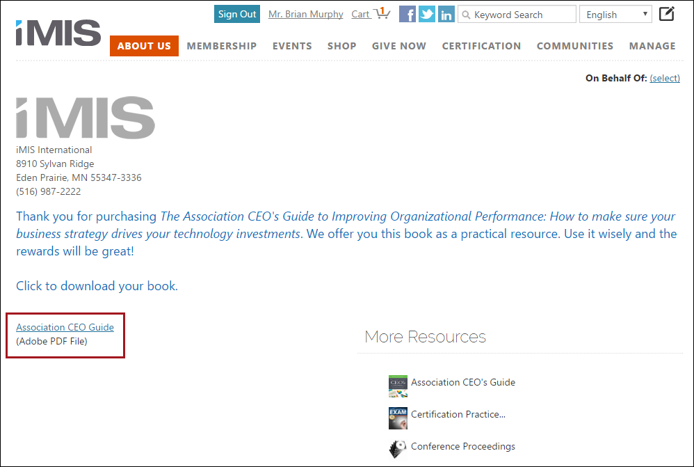
Content File
This content item displays a link for users to download a file. The file is uploaded during configuration of the content item. The Content File content item can be used on any content record.
Content Html
Using the Content Html content item, you can add simple content to your website anywhere you want. In addition to the WYSIWYG functionality, you can switch to HTML mode to insert JavaScript to embed other sites, display web widgets, and use variables to create relative paths.
Before you begin:
- The Content Html content item does not support C# script blocks. If JavaScript cannot be used instead of C#, the C# code needs to be ported to a first class content type and a new content item needs to be created. For information on using redirects see Content records.
- The <form> tag cannot be placed on any page in RiSE because every page already has a <form> tag surrounding everything on the page, and the <form> tags cannot be nested inside one another.
- The editor will automatically attempt to correct invalid and improperly formatted HTML, such as missing end tags, or unsupported tags and attributes. Note that according to HTML standards, some tags cannot be placed inside of others. For example, <div> tags cannot be placed inside of <span> tags.
-
Content added to an https web page using an <iframe> must match the protocol of the parent page. When the URL is invalid, cannot be found, or is insecure based on iMIS site protocols, the following will happen:
- The iFrame content will not load.
- Error messages will display based on the relevant scenario:
- The content can’t be included because the requested information can only be loaded on: [URL Entered] — The URL entered in the iFrame cannot be loaded on a different domain than its original domain.
- The content can’t be embedded because the security protocols do not match. Frame URL provided — The embedded content is not secure (http), but was loaded in an https iMIS site.
- The content can’t be embedded ([URL Entered]). Please verify the URL entered — The page cannot be reached. It may be down, or the URL is invalid.
- The content can't be embedded because the requested information has been moved for: [URL] — The page URL included within the iFrame is being redirected to another location (server 301 redirect, permanent redirect).
📘 Note
We recommend using an online validator tool to help correct or validate any errors.
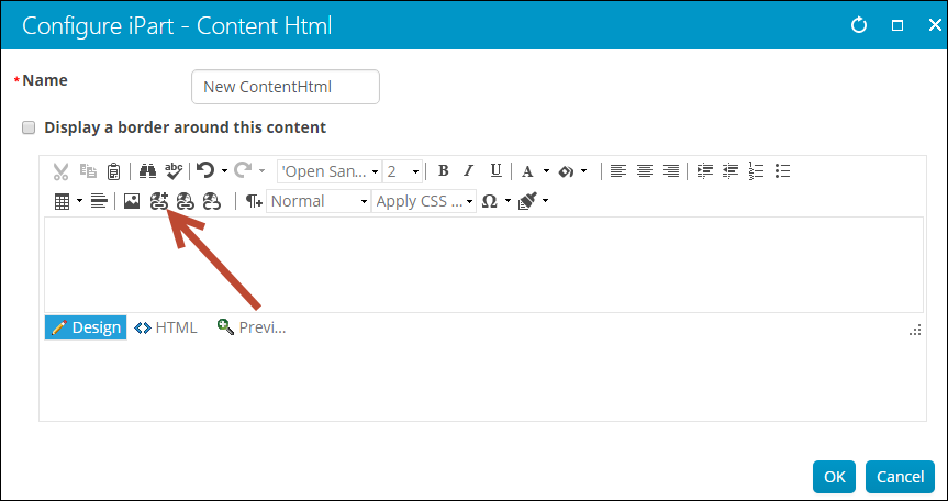
Understanding the toolbar icons
-
 - Full screen mode
 -
 - Cut, Copy, Paste
 -
 - Find and Replace, Spell check, Undo, Redo
 -
 - Font name, Font size, Bold, Italics, Underline
 -
 - Font color, Font highlight color
 -
 - Left align, Center align, right align
 -
 - Indent, Outdent, Insert numbered list, Insert bullet list
 -
 - Insert table, Insert horizontal line, Insert image
 -
 - Content Link Manager, Insert link (hyperlink, anchor, or email), Remove link
 -
 - Insert new paragraph, Paragraph style, Apply CSS Class, Insert Symbol, Format Stripper:
- Apply CSS Class - You can use the Apply CSS Class drop-down to apply styling and formatting to specific portions of the content. Select the area you want to style and choose a CSS class from the drop-down.
- Format Stripper - Takes away any of the formatting that was applied. You have the option to select the type of formatting you want to take away from any highlighted content: All, Css, Font, Span, or Word.
Embedding external sites
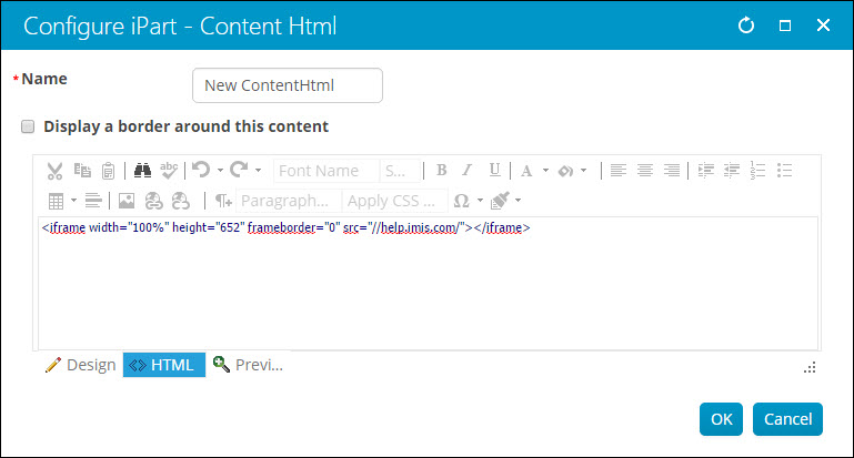
To embed any external page into an iMIS site, you can use an <iframe> like this:
- From the Staff site, go to RiSE > Page Builder > Manage content and create a new content record.
- Select add content and place a single Content Html content item on it (from the ContentTypes folder).
- Show the source by clicking the <> HTML tab and type in an iframe tag, such as this:
<iframe width="100%" height="652" frameborder="0" src="//help.imis.com/"></iframe>
📘 Note
To avoid having content blocked (resulting in a Mixed Content error) do not include http: or https: in the src element. - Go to RiSE > Site Builder > Manage sitemaps and create a new navigation item that points to the new content record.
- If appropriate, restrict the navigation item's Access Settings, such as to Authenticated User Full Control.
Inserting links
To insert a direct link to any content in iMIS or to an external site, you can use the content link manager:
- Create a new content record with the Content Html content item, or edit an existing record to insert a link.
- From the editor toolbar, select the content link manager icon:
- Choose a Link type:
Content or URL
This link allows users to travel to a separate webpage.
- Enter the Link text.
- To define the Content or URL do one of the following:
- Select content from the Document Browser.
- Type in a content record's direct path. For example, @/iCore/DefaultStaff.
- Type in a shortcut URL. This will preserve the link even if the content is moved in the document system. The shortcut must conform to the format ~/Shortcut.
- Type in a direct link. For example, http://www.help.imis.com.
- Enter a CSS Class that will be applied to the link.
- If the Content or URL is pointing to an iMIS content record, select a Default website.
- Enter or select a Source code to associate this link with a marketing campaign.
- Enter Additional URL parameters to include in the link. To add multiple URL parameters, follow this format: param1=value1¶m2=value2¶m3=value3
Downloadable document
This link allows users to download a document:
- Enter a link description for Link text.
- From Document, select the desired file, or upload a new file by clicking New. If the content record you are working with is new, you must save the content record before you are able to upload a new file.
- Click OK.
- (optional) Enter a CSS class for the link.
📘 Note
To manage these files, go to RiSE > Page Builder > Manage files. - Click OK.
📘 Note
If the content record you are working with is new, you must save the content record before you are able to upload a new downloadable document.
Displaying web widgets
You can install and display JavaScript-based web widgets (plugins, gadgets) in your WCM-generated websites using the Content Html content item. A web widget is a small program that your users can execute within a web page and that can provide a wide range of functionality.
For example, Google Gadgets offers thousands of free web widgets including mini applications, games, news feeds, maps, and a wide range of other types of content. Many other websites also provide free widgets that can access data from their site. For example, Twitter provides widgets that let you display Twitter updates on your website. LinkedIn provides plugins that display information such as company profiles, member profiles, and links to share on LinkedIn. You just have to search the web to see what you can find that meets your needs.
🚧 Warning
Only embed widgets from authors whom you trust. Malicious code may damage your computer or violate your privacy.
To add a JavaScript-based web widget to a webpage
- Go to RiSE > Page Builder > Manage content.
- Create a new content record or edit an existing one.
- Click add content to find and select the Content Html content item.
- Click < > HTML to switch to HTML mode.
- Copy the JavaScript embed code for the widget you want to add and paste it into the HTML area.
- Click OK, then Save and Publish your content record. The widget is displayed when that content record is rendered on a webpage.
Creating relative paths using variables
The Content Html content item does not support the use of the ~/ (tilde slash) shortcut, often used to automatically build the correct paths when a control is rendered in different domains. However, several variables are available in this content item that allows you to enter paths for links and resources that are automatically resolved to various folders in your website.
- [Website] and [@] – Both variables resolve to the root of the website and contain the website name. For example, [Website]Home.aspx resolves to http://mydomain/Staff/Home.aspx.
- [~] and [Root] – Both variables resolve to the root of the website. For example, [~]Home.aspx resolves to http://mydomain/Home.aspx.
- [Common] – Resolves to the AsiCommon directory of the website. For example, [Common]images/image.png resolves to http://mydomain/AsiCommon/images/image.png.
- [iMIS] – Resolves to the iMIS directory of the website. For example, [iMIS]images/image.png resolves to http://mydomain/iMIS/images/image.png.
- [Theme] – Resolves to the website’s theme folder. For example, [Theme]images/image.png might resolve to http://mydomain/App_Themes/Orion/images/image.png. This variable can be used to access theme resources such as images and CSS.
📘 Note
Images that use relative paths do not render in Design mode because the variable is not transformed until the content record is published.
Content Link
- Description - Displays a simple web link (URL).
-
Usage Scenario -
Content Page Break
- Description - Adds a page break into the content record, so that the webpage is paginated. Any content items below the Page Break are displayed on another page.
-
Usage Scenario -

Content Reference
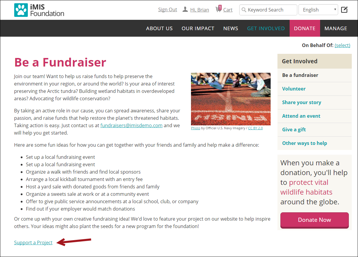
This content item creates a link to another piece of iMIS content. The name of the content record being referenced will be the name of the link. For example, if the content record name is Support a Project, the link will appear as Support a Project.
Content Tagged List
- Description - Inserts a dynamically generated list of links to content that has been tagged.
-
Usage Scenario -
Data Showcase
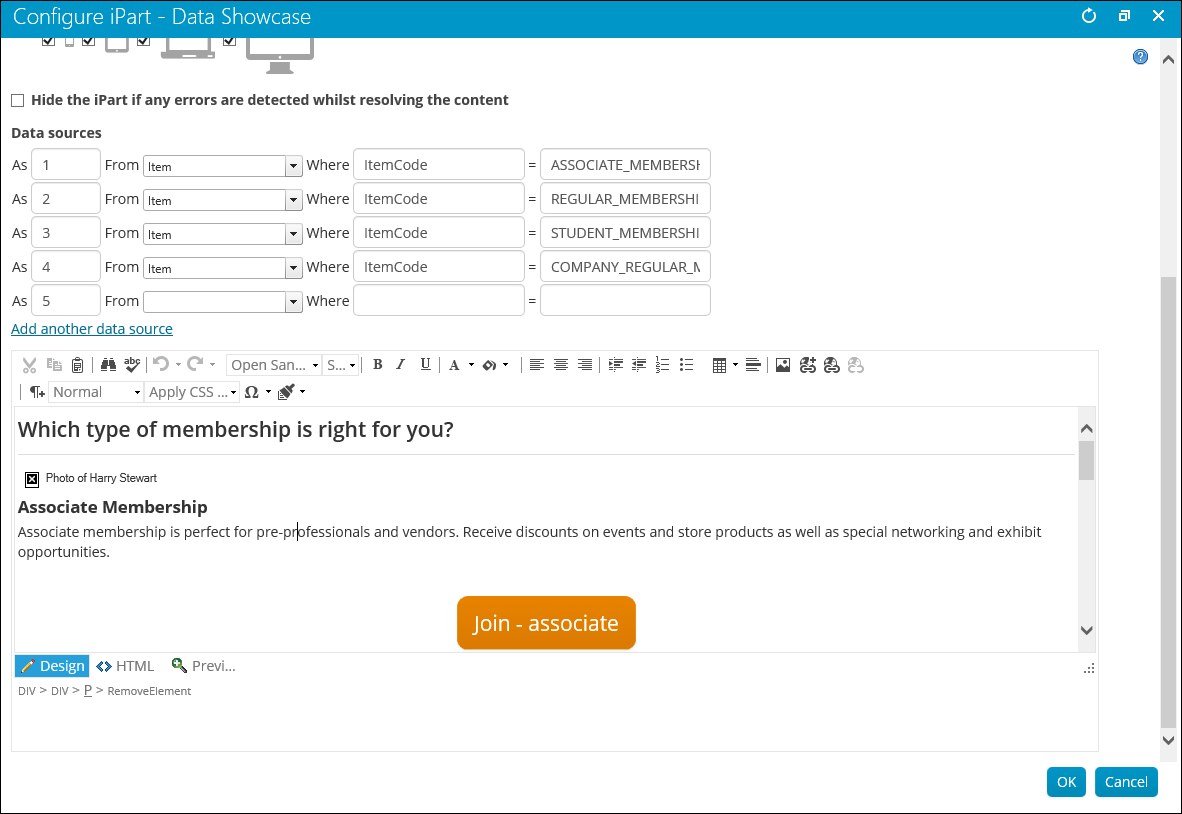
- Description - This content item lets you leverage HTML to create compelling designs. The Data Showcase lets you combine this power with variables that merge in your iMIS data, dynamically and reusably. When you specify data sources, such as Event or Party, you can then use variables in your HTML that will insert values from these data sources (such as venue details), styled for your needs. You can use {foreach} structures to display groups of values (such as all functions), and you can have the content item hide itself if it detects any data errors.
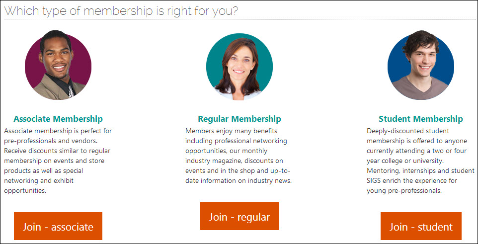
- Usage Scenario - If you have three different types of memberships you can use the Data Showcase content item to display and describe these differences.
Configuring the Data Showcase
You can define any number of data sources. For your data source, you may use any valid data contract, minus the "Data" suffix. For example, EventData is sourced as Event. Browse the Common Entity Types for key data contracts (entities) and their properties:
Each data source has the following properties:
- As - The value by which to refer to the data source. Each data source must have a unique value or name.
- From - The SOA entity type that the data source returns.
-
Where - The where clause used to locate the entity. This consists of the following:
- Property - The entity property to search on. Typically the entity Id (EventId, PartyId, or ItemId). Multiple properties may be specified using | as a delimiter. For example, PartyId|ItemId.
- Value - The value to search for. This can be retrieved from a URL parameter. When using multiple Where properties, supply a value for each property using | as a delimiter. For example, 260|G15.
You can use the @SelectedID variable to filter by a selected contact ID. The ID is selected based on the ID passed in the URL parameter. If no ID is passed in the URL, the ID is considered to be the On Behalf Of contact's ID (if set), or the logged in user's ID. You can use this variable when you specify PartyId as the Property.
You can retrieve the Value property of the Where clause from the URL. This allows a single content item to dynamically display details from a given entity by providing the Id value of the entity (or other such unique property value) in the URL.
To read a parameter value from the URL, use the syntax url:parameter, where parameter is the name of the URL parameter. For example, url:EventKey.
📘 Note
Where the data source matches multiple entities, only the first entity is resolved into the content.
Data Showcase data source examples
Consider a situation where we want to select the Annual Conference event, which has an event code of ANNCONF. Enter the following values:
As event where EventID = ANNCONF
Now you can use the object named event to select certain properties about that event. In the HTML editor you can enter the following:
Heads up! The {#event.Name} starts on {#event.StartDateTime Format="M"}. Register today!
When you view the published content, the following is displayed:
Heads up! The Annual Conference starts on June 15. Register today!
You can also select an item based on a parameter that is passed in the URL. For example, when visiting an event page in iMIS, the EventKey in the URL identifies the event you are viewing. To select an event based on the EventKey in the URL, enter the following values:
As event from Event where EventID = url:EventKey
Now you can use the following HTML:
Heads up! The {#event.Name} starts on {#event.StartDateTime Format="M"}. Register today!
When you view the page it will display the information for whichever event you are viewing.
Another way to select items is based on the ID of the currently-selected user, which is determined by the following:
- The ID in the URL parameter, if available (such as when viewing an account page)
- The user you are working On Behalf Of, if applicable
- The logged in user
📘 Note
If unauthenticated users view your content, the content will not display correctly, and there will be blank areas in your content where the variables should be. Or, the content will be hidden completely if you select Hide content if any errors are found.
To select a contact based on the currently-selected contact, enter the following:
As party from Party where PartyID = @SelectedID
In the HTML editor you can enter the following:
Welcome, {#party.Name}!
When you view the published content, the following is displayed:
Welcome, Sally!
Using placeholders
Use placeholders within the content and the title to denote areas that will resolve against the data sources. Placeholders may also be used to populate attributes within HTML tags, such as the src attribute of <img> and <a> tags. Placeholders are specified using { } notation. For example:
{datasource[.property... ] [attributes]}
The {#...} placeholder embeds data into the content or title at the placeholder location. The placeholder consists of the following components:
- datasource - The name of the data source.
- property - (optional) The name of the property. May be chained together using dot notation. For example, prop1.prop2.prop3. Where the property is a collection, a specific item may be accessed using [i] notation. For example, .Address[1] would return the item at index position 1 from the Address collection.
-
attributes - (optional) A space delimited set of attributes, some of which require values. Multiple attributes may be specified:
- uppercase - Convert the data to uppercase
- lowercase - Convert the data to lowercase
- format - Format non-string values, such as Format="d", for date (search MSDN for iFormattable)
- noencode - Do not HTML encode the data. This is useful where the data contains HTML markup that you wish to be rendered in the browser.
- resolve=~ - replace any ~ (tilde) characters in the data with the webroot url. This is useful where the property is a URL that uses ~ notation to denote the webroot, such as a Events.ImageUrl.
👍 Example
<strong>{#Party.FirstName noencode}</strong>
Examples:
{#event.Name}
{#event.Name uppercase}
{#event.StartDateTime format="d"}
{#party.Status.Name}
{#party.Addresses[1].Address.CityName}
<img src="{#event.ImageUrl resolve=~}">

Foreach {foreach alias in source [orderby [property,... ]] [limit[number]]}
The {foreach} placeholder must have a closing {/foreach} placeholder. The content between the opening and closing placeholders is the inner content. The inner content may contain placeholders, including nested {foreach} placeholders. The inner content is repeated and resolved against each item in the collection.
The placeholder consists of the following components:
- alias - A name for the data source that will represent the current item in the collection. This data source will be used in placeholders within the inner content to refer to the item being processed.
- source - A data source and property path that refers to the collection to iterate through e.g. event.Functions. If the data source itself is a collection, the property path may be ommitted (typically only used in nested foreach loops for iterating through collections of collections).
-
orderby - (optional) To order the collection, use the orderby keyword followed by a comma-delimited list of properties to order the collection by.
- A maximum of five sorting properties may be specified.
- Property names must refer to properties of the objects within the collection and may be chained using dot notation.
- Do not specify a data source in the property names.
- limit - (optional) To limit the number of records processed in the collection, use the limit keyword followed by the maximum number of records you want processed. Limit is applied after the entire collection has been sorted using the orderby clause.
The entire collection is ordered before the optional limit clause is applied.
Examples:
- Display the city from each party address:
- Display the name of each function in an event, ordering by the start date and name, and have the data display as an ordered list:
{foreach a in #party.Addresses}
{#a.Address.CityName}
                            {/foreach}
<ol>
{foreach f in #event.Functions orderby StartDateTime,Name}
<li>
{#f.Name}</li>
{/foreach}
</ol>
The communication creator uses this same functionality. For more information, see steps 5 and 6 in Defining a new email template.
Example: Conditional logic in the Data Showcase content item
Sometimes it is helpful to be able to conditionally control what is displayed in the Data Showcase content item based on a value retrieved from the database. In this example, the Data Showcase was added to the Account Page Staff content record. This simple example is using Party ID information to detail whether the contact is a man, woman, or unidentified by looking at the Mr., Mrs., Miss, or blank prefix in their name.
The end result will look something like this:
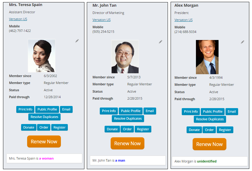
- The actual content for this example is short.
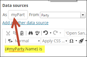
- Once the Data sources are specified, its time to insert some javascript. This is where you identify what information from the data source that you want to use. In the content item, click the HTML tab. This is what we have in the HTML tab for this example:
Where {#myParty.Name} is injecting the Party name from the data source (myParty). The data source is using the Party property where the PartyId equals the ID in the URL to find the Party record.
For example, Teresa Spain’s ID is 19384. As long as the parameter ID=19384 is in the URL, we will use Teresa’s party record as the data source. 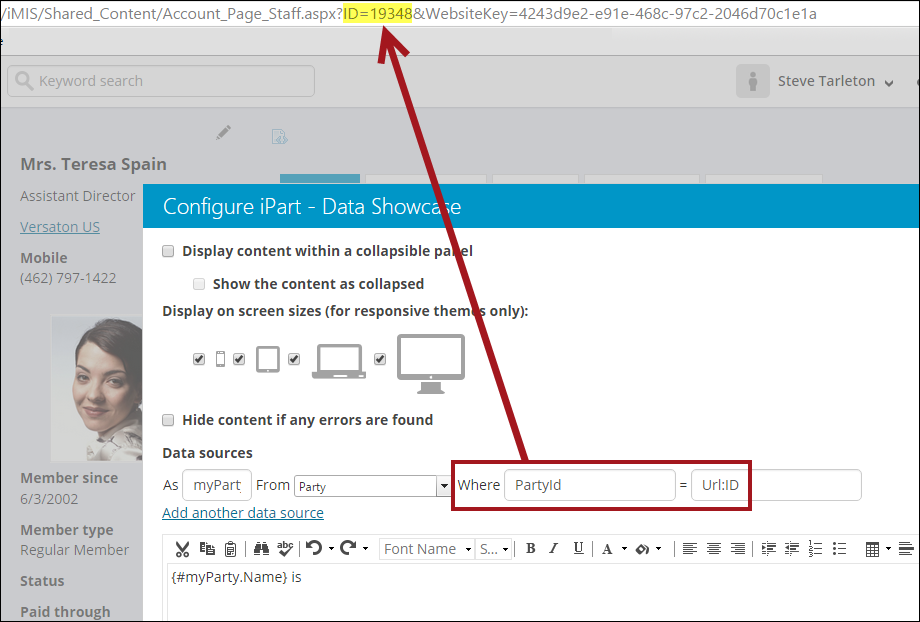
<script>
// Use jQuery to add an onready function
jQuery(function()\{
// read the prefix from the hidden field it was injected into and tidy it up
var prefix =
jQuery("#NamePrefix").val().toUpperCase().replace(".","");
// figure out which of the man,woman,unidentified spans to show
var spanId = "#unidentified";
switch (prefix) {
case "MR":
spanId = "#man"
break;
case "MRS":
case "MS":
case "MISS":
spanId = "#woman"
break;
}
// show the span
jQuery(spanId).show();
\});
</script>
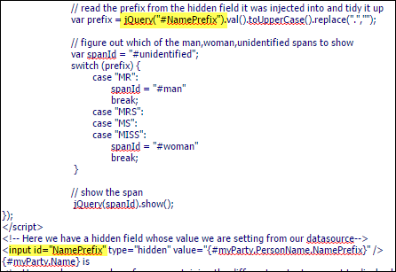
<!- Here we have a hidden field whose value we are setting from our datasource->
<input id="NamePrefix" type="hidden" value=" {#myParty.PersonName.NamePrefix}" />
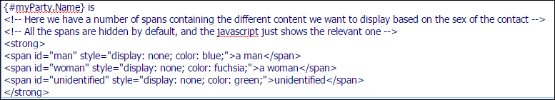
{#myParty.Name} is
<!- Here we have spans containing the different content we want to display based on the sex of the contact ->
<!- All the spans are hidden by default, and the javascript shows the relevant one ->
<strong>
<span id="man" style="color: blue; display: none;">a man</span>
<span id="woman" style="color: fuchsia; display: none;">a woman</span>
<span id="unidentified" style="color: green; display: none;">unidentified</span>
</strong>
In this example, we opened up a script block and are using a jQuery to inject an onready function, so that this function will run after the page has loaded. The actual function contains all of the logic, but for now let's review the hidden input field:
\
\
{#myParty.PersonName.NamePrefix}So we know that it is coming from data source myParty, and that PersonName.NamePrefix is going to be the value property of the hidden control. You don't have to use a hidden control, you can use a span, div, or anything you like, but you need to be able to get to it later by name or ID.
For our example, we've given the input control an ID of NamePrefix, which is used in the jQuery in the lines above to access the element and read its value:
These IDs can be anything you would like, for example, larger text, images, or tables. When the page loads, the jQuery ready function runs. While it runs it is looking at this text:
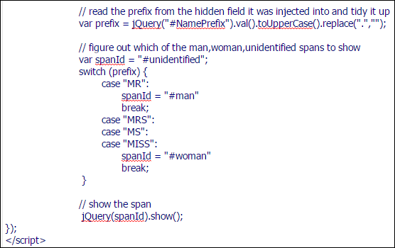
It's pulling the NamePrefix data we described earlier, and then it cleans the text up a little, making the name prefix uppercase, and getting rid of any periods at the end of it. So at this point we will end up with capital MR, MRS, MS, and so forth.
Panel Collection Editor and Panel Editor
For more information, see Panel Designer.
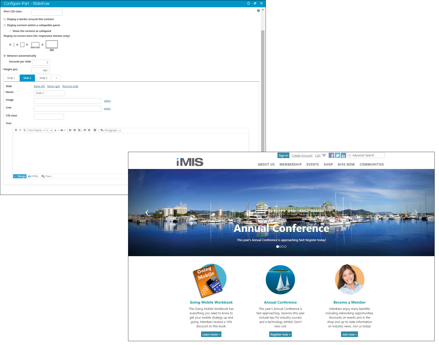
Slideshow
- Description - The Slideshow content item enables you to place images on any content record in a visually appealing slideshow format. Each image is defined on an individual tab. You can customize each image with formatted text, designate the order in which the images display, and configure each slide to contain a hyperlink.
- Usage Scenario - Place the Slideshow content item on your website’s home page. This is a simple but effective way to welcome guests to your website, illustrate your core mission, or promote upcoming events.
-
📘 Note
This content item is not WCAG Level AA Accessible. If your site must be WCAG Level AA Accessible, do not use this content item.
📘 Note
A link can be defined in the Link field, or within the custom HTML, but not both at the same time. 📘 Note
Text embedded in the slideshow image may be cut off on certain devices, and makes your site less accessible to the visually impaired. The Text field is the best place for text.