Implementing advanced website navigation features
In addition to creating your navigation items and sitemap in RiSE, you can further tailor your site's navigation by implementing advanced navigation features, such as left navigation, mega drop-downs, and using image sprites for navigation items. To add these features, you will need to edit your site's theme and master page.
Displaying left navigation
You can display website left navigation in a hierarchical format with a few changes to your theme’s master page and skin file.
Do the following to display website left navigation:
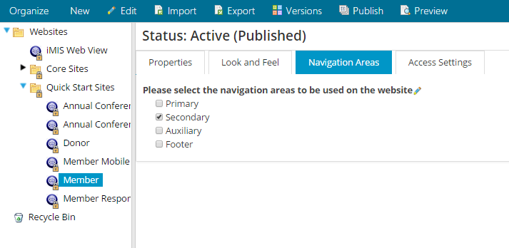
- From the Staff site, go to RiSE > Site Builder > Manage websites.
- Define how many levels of navigation to display.
- Select the website.
- Select the Navigation Areas tab and select the Secondary navigation area.
- Save and publish your changes.
- Edit the website theme’s master page.
Click for details
- Using your preferred text editor, find and open the website theme’s master page. Master pages, by default, are located in C:\Program Files (x86)\ASI\iMIS\Net\Templates\MasterPages.
- Register the control by adding the following line to the top of the master page, just below the other registered controls:
<%@ Register TagPrefix="asi" TagName="SubNavigation" Src="~/AsiCommon/Controls/Navigation/SubNavigation.ascx" %>
- Add the following scripts to the <script language="C#" runat="server"> section:
protected override SiteMapNode GetStartingNode()
{
 	return Secondary.GetStartingNode();
}
protected override SiteMapNode GetCurrentNode()
{
	return Secondary.GetCurrentNode();
} - Find the masterSideBarPanel div. It should look like this:
<div id="masterSideBarPanel" class="yui-b">
	<asp:ContentPlaceHolder ID="SideBarPlaceHolder" runat="server">
	</asp:ContentPlaceHolder>
</div> - Update the masterSideBarPanel div so that it contains the following:
<div id="masterSideBarPanel" class="yui-b">

	<asp:Panel ID="SubNavPanel" runat="server" >
			<asp:ContentPlaceHolder ID="PageSubNavigationPlaceHolder" runat="server">
			<asp:Panel id="SubNavHead" runat="server" class="SubNavigationHead">
			<asp:Literal ID="SubNavPanelTitle" runat="server" />
			</asp:Panel>
			<asp:Panel id="SubNavBody" runat="server" class="SubNavigationBody">
			<asi:SubNavigation id="Secondary" runat="server" NavigationPaneCode="2"
				StartingNodeOffset="1" StartFromCurrentNode="true"
				StartingNodeOffsetAutoSet="true" SelectDefaultNode="false" />
			</asp:Panel>
			</asp:ContentPlaceHolder>
		<asp:ContentPlaceHolder ID="SideBarPlaceHolder" runat="server" />
	</asp:Panel>

\
\To improve JavaScript performance for websites using hierarchical sub-navigation, find the following script: \Update that script to the following: \Edit the website theme's skin file Click for details
- Using your preferred text editor, find and open the website theme’s skin file (for example Aspen.skin). Skin files, by default, are located in the theme folders within C:\Program Files (x86)\ASI\iMIS\Net\App_Themes.
- Register the control by adding the following line to the top of the skin file, just below the other registered controls:
<%@ Register TagPrefix="asi" TagName="SubNavigation" Src="~/AsiCommon/Controls/Navigation/SubNavigation.ascx" %>- Just below the section registering controls, add the following line:
<asi:SubNavigation runat="server" Skin="Aspen" EnableEmbeddedSkins="false" SingleExpandPath="true" ShowLineImages="false" />- (optional) If you are familiar with skin controls, you can configure how the SubNavigation control behaves using the following properties:
- string NavTreeSkinId – A unique ID for the skin if needed. The default is RadTreeView.
- bool SingleExpandPath – Gets or sets a value indicating if only the current branch of the tree is expanded. The SingleExpandPath property, when set to True, automatically collapses nodes that are not on the path of the currently expanded node. Use the SingleExpandPath property when you need to conserve screen space and make navigating nodes easier.
- public bool ShowLineImages – Gets or sets a value indicating if the tree node line images display or not.
- string Width – Gets or sets width of the control. Specify in pixels (px) or percentage (%), such as 500px or 90%.
- bool EnableEmbeddedSkins – Gets or sets a value indicating if the built in skins should be used on the navigation tree.
- int MaxDataBindDepth – Gets or sets the maximum number of levels to bind to the navigation tree.
- bool WrapNodeText – Gets or sets the option to wrap text if it is wider than the trees allowed width.
- bool ExpandAllNodes – Gets or sets the option to expand all of the nodes when the navigation tree renders.
Displaying mega drop-downs
You can display mega drop-downs from your primary navigation with a few changes to your theme’s skin file and menu CSS.
Mega drop-downs display navigation items within large panels, grouped by level, which reduces scrolling and improves the usability of site navigation.
Implementing mega drop-downs
Do the following to implement a mega drop-down:
- Ensure that each parent navigation item or its first child in the sitemap has a value for Content or URL to Link to. Otherwise, the navigation hierarchy may not render properly.
- Edit the website theme's skin file
Click for details
- Using your preferred text editor, find and open the website theme’s skin file (for example, Austin.skin). Skin files, by default, are located in the theme folders within C:\Program Files\ASI\iMIS\Net\App_Themes.
- Find one of the following:
- pageNavR - Update this control if you are using a non-Theme Builder theme, such as Austin. Any non-Theme Builder theme is a theme that was created not using Theme Builder.
- PrimaryNavigation - Update this control if you are using a Theme Builder theme.
- Update the correct control (either pageNavR or PrimaryNavigation) to the following:
EnableMegaDropDownMenu="true"- (optional) If you are familiar with skin controls, you can configure how the mega drop-down behaves by altering the following properties:
- EnableMegaDropDownMenu – Enables the mega drop-down.
- MegaDropDownMenuShowStartingNode – Displays the parent navigation node as the first item in the mega drop-down. Enter true or false.
- MegaDropDownMenuLevelSettingLevel – This property sets specified menu nodes per level with a default per level of "1", and a minimum per level of "1". This property defines the navigation level at which the number of columns set for MegaDropDownMenuRepeatColumns starts to take effect. For example, if you set MegaDropDownMenuRepeatColumns="3" and set MegaDropDownMenuLevelSettingLevel="2", then the mega drop-down displays three columns for the second navigation level and higher, and the first level has one column only.
📘 Note
For out-of-the-box responsive themes, your navigation will not show in the responsive site mega drop-down if you have more than three levels of navigation. However, they will be displayed in the secondary navigation.- MegaDropDownMenuRepeatColumns – Defines the number of columns used to display the navigation. This property sets the number of display columns for the mega drop-down menu’s specified number of columns (default is "2", minimum is "2").
- MegaDropDownTooltipLocation – This option only applies to tooltips defined for top-level navigation items in the primary navigation. When defined, it specifies the location of the tooltip text if a tooltip is defined for that navigation item. Enter either Menu (displays the tooltip directly beneath the top-level navigation item) or Append (displays to the right of the navigation text within the drop-down). If you do not define this property, navigation tooltips are not displayed in the drop-down.
- MegaDropDownMenuRepeatDirection – This property sets the mega drop-down menu repeat direction and determines the order in which items are rendered as either Horizontal or Vertical (default is Vertical). If set to Vertical, the items display in columns loaded from top to bottom, then left to right, until all items are rendered. If set to Horizontal, the items display in rows loaded from left to right, then top to bottom, until all items are rendered.
- Edit the theme’s menu CSS to tailor the display of the mega drop-down for the theme’s look and feel.
Click for details
- Using your preferred text editor, find and open the website theme’s menu CSS file (for example Menu.Aspen.css). Menu CSS files, by default, are located in the theme folders within C:\Program Files\ASI\iMIS\Net\App_Themes.
📘 Note
The styling for the Austin drop-downs are included in 99-Austin.css.- Find the MegaDropDownMenu Styling section and edit the styles as needed:
/* ########################## */
/* MegaDropDownMenu Styling */
/* ########################## */
.RadMenu .rmGroup .MegaDropDownMenuOuter .rmText {
padding: 0;
margin: 0;
width: 600px !important;
}
div.MegaDropDownMenu
{
background-color: #f8f7f7;
padding-left: 5px !important;
padding-right: 5px !important;
}
.MegaDropDownMenuToolTip
{
padding: 5px;
}Styling mega drop-downs
You are able to make changes to the layout and look of your mega drop-downs. You can add control properties in the .skin file, and you can add custom CSS classes.
For example, you could style your mega drop-down to look like the following
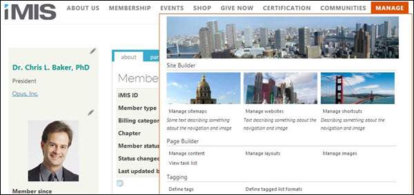
To create a mega drop-down that looks like this, you would first set one of the following control properties in the .skin file:
- pageNavR - Update this property if you are using a non-Theme Builder theme. A non-Theme Builder theme is any theme created not using Theme Builder, such as Austin, London, or Toronto.
- PrimaryNavigation - Update this property if you are using a Theme Builder theme, such as Great Barrier Reef Responsive.
For example, for the Austin theme, you would edit the Austin.skin file with the following bolded changes:
<asi:PageNavR runat="server" Skin="Austin" EnableEmbeddedSkins="false" EnableRootItemScroll="false"
Flow="Horizontal" DefaultGroupSettings_Flow="Vertical"
DefaultGroupSettings_OffsetX="0" Width="100%"
EnableMegaDropDownMenu="true"
MegaDropDownMenuShowStartingNode="false"
MegaDropDownMenuLevelSettingLevel="0"
MegaDropDownMenuRepeatColumns="3"
MegaDropDownTooltipLocation="Append"/>Next, add custom CSS classes to the 99-Austin.css file:
.SiteBuilderNode:before {
padding-right: 5px;
content: url(http://lorempixel.com/output/city-q-c-550-100-5.jpg);
}
.ManageSitemapNode:before {
padding-right: 5px;
content: url(http://lorempixel.com/output/city-q-c-175-75-6.jpg);
}
.ManageSitemapNode:after {
padding-right: 5px;
font-style: italic;
float:right;
content: "Some text describing something about the navigation and image";
}
.ManageWebsitesNode:before {
padding-right: 5px;
content: url(http://lorempixel.com/output/city-q-c-175-75-3.jpg);
}
.ManageWebsitesNode:after {
padding-right: 5px;
font-style: italic;
float:right;
content: "Text describing something about the navigation and image";
}
.ManageShortcutsNode:before {
padding-right: 5px;
content: url(http://lorempixel.com/output/city-q-c-175-75-9.jpg);
}
.ManageShortcutsNode:after {
padding-right: 5px;
font-style: italic;
float:right;
content: "Describing something about the navigation and image";
}Using image sprites for navigation items
A sprite is a collection of images combined into a single image. Using CSS, you can shift the image around to display only parts of it. The advantage of using sprites is that they reduce the number of server requests to load images (only one is loaded), leading to improved performance.
One way to use sprites in iMIS is for rollover effects on navigation items.
- Edit the website theme’s skin file.
- Using your preferred text editor, find and open the website theme’s skin file (for example Aspen.skin). Skin files, by default, are located in the theme folders within C:\Program Files (x86)\ASI\iMIS\Net\App_Themes.
- Find the pageNavR (or PrimaryNavigation for Theme Builder themes) control and update it to add the following property:
EnableImageSprites=”true”When enabled, a new class named rmLeftImage is added to root level links in PageNavR.
- Create the sprite file.
- Using an image editor like Adobe Photoshop, or a free alternative like GIMP, create your sprite by adding the images you want to a single image, like the following:
- Save the sprite to the website theme’s image folder.
- Edit the theme’s 99-[theme].css file to define the classes to control the sprite.
- Use a tool like SpriteCow to determine the position values of the images in the sprite.
- Using your preferred text editor, find and open the website theme’s 99-[theme].css file, located by default in the theme folders within C:\Program Files (x86)\ASI\iMIS\Net\App_Themes.
- Add styles for the sprite. For example:
.RadMenu a.rmRootLink.CartLink .rmLeftImage
{
Background-image: url(images/cartsprite.png);
Background-repeat: no-repeat;
Background-position: -1px -1px;
Width: 48px;
Height: 36px;
}
.RadMenu a.rmRootLink.CartLink:hover .rmLeftImage, .RadMenu a.rmRootLink.CartLink.rmExapnded .rmLeftImage,
.RadMenu a.rmRootLink.CartLink.rmFocused .rmLeftImage
{
Background-position: -1px -39px;
}The first group of selectors sets the resting position for the image sprite. The second group of selectors defines the hover state and shifts the image when the link is rolled over.
- From the Staff site, go to RiSE > Site Builder > Manage websites.
- Apply the sprite class to the appropriate navigation items.
- Edit the navigation item for which you want to apply the sprite hover effect (for example, the Shop).
- For the CSS Class property, enter the sprite class (for example, CartLink).
- Save and publish the navigation items.
