
Header Settings
Administrators can customize the Header of the Landing Page to their specifications by editing the Header Settings.
To customize the Header Settings, do the following:
- Go to Customizations > Landing Page.
- From the drop-down, select Header Settings.
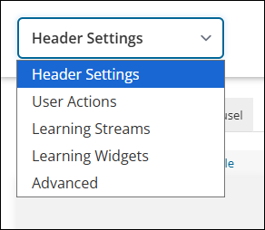
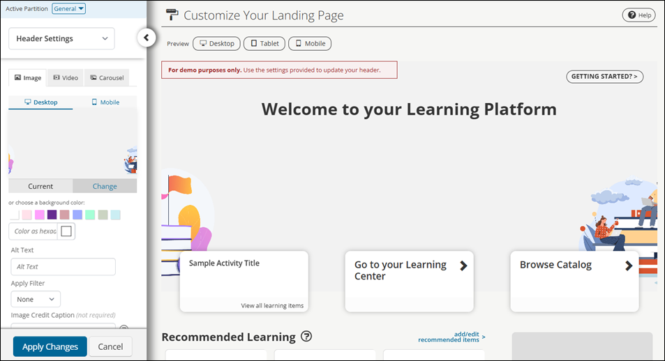
Customizing the Header Settings
The Header Settings are fully customizable.
After configuring Header Settings, select Apply Changes to view updates. Be sure to test changes using the Desktop and Mobile device preview buttons in the Image tab.
Image tab settings
The Image tab sets the Landing Page to use an image or a background color as the Header's background.
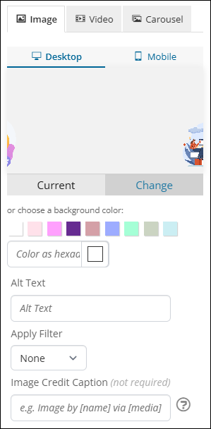
Use the Desktop and Mobile device preview buttons to preview and set images with desktop and mobile device resolutions. The Current view shows the current background image or color. The Change view shows a list of uploaded images that an administrator can choose from to set a background image. Alternatively, drag and drop an image file into, or select a file from, the upload file pane to upload a new image.
NoteThe recommended image dimensions, file size, and file type are: 1440px x 500px, 100-300kb, and .JPEG or transparent .PNG, respectively.
Alternatively, administrators can choose a background color from the color palette, select a background color using the Banner Background Color picker, or input a background color in the form of a hexadecimal color code.
The following settings are available in the Image tab:
- Alt Text - Define the alt text for the header's background image.
- Apply Filter - Apply a filter to the background image. The options include None, Dark, Light, Blur, Grayscale, Warm, and Cool.
- Image Credit Caption (optional) - If set, users see the caption when they hover over the Landing Page header image or click the Landing Page header image on mobile devices.
Video tab
The Video tab sets the Landing Page to use a video as the header background.
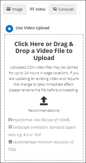
The following settings are available in the Video tab:
- Use Video Upload - If selected, upload a video by drag-and-drop controls into, or selecting a video file in, the upload pane.
- Apply Filter - Apply a filter to the background image. The options include None, Dark, Light, Blur, Grayscale, Warm, and Cool.
- Video Credit Caption (optional) - If set, users see the caption when they hover over the Landing Page header video or click the Landing Page header video on mobile devices.
NoteThe recommended video file type, orientation, aspect ratio, and resolution are: .mp4, landscape orientation, standard aspect ratio (such as 4:3 or 16:9), and 720p (at the minimum), respectively. The maximum file size for uploaded videos is 100mb. Only .mp4 videos are supported.
- Use Video Share Link - If selected, define a link to a video on a video sharing site, such as YouTube.
- Show Background Image for Mobile - If toggled, the header shows the Mobile background image or color set on the Image tab instead of a video. If a Mobile version isn't set, the Desktop version is used instead.
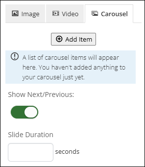
Carousel tab
The Carousel tab sets the Landing Page to use a Carousel layout.
To set up a Carousel, do the following:
- Go to Customizations > Landing Page.
- From the drop-down, select Header Settings.
- Click the Carousel tab.
- Configure the carousel with items:
- Click Add Item.
- Choose a Title for the carousel.
- Choose a Background with one of the following options:
- Background image - Select Change. Drag and drop an image or select an image to upload.
- Background color - Choose a background color from the palette or pick a color with the Background Color picker. Alternatively, input a hexadecimal color code.
- Define the Alt Text, Apply Filter, Image Credit Caption, Tagline, and Call-to-Action settings as in the Image tab.
- Repeat step 4 for additional carousel items.
- Click Add.
- Click Apply Changes.
Once carousel items are defined, drag the arrow icons next to the carousel items to reorder them.
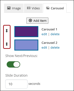
The following settings are available for the Carousel tab:
- Show Next/Previous (optional) - When toggled on, the Landing Page header shows indicators of what slide the carousel is currently on.
- Slide Duration (optional) - Define the amount of time, in seconds, a slide remains active in the Carousel. If left blank, the default value is 10 seconds.
Tagline
A Tagline is the text shown to users in the header section of their Landing Page. Taglines can be used to welcome users, convey an important message, set a tone, and more.
Taglines should be kept simple and brief, as taglines are also displayed on devices with smaller resolutions, such as tablets and phones.
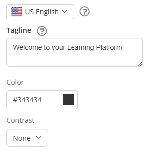
The following settings are available for the Tagline:
- Set Language To - Select the language version of the Tagline and Call-to-Action text. Users who have their language preference set to the selected language will see the translated text if provided. By default, the system' default language is selected.
- Tagline - Define the text displayed at the top of the Landing Page header.
- Color - Set the Tagline's text color.
- Contrast - Set the Tagline's background color. The options include None, Dark, Light, Warm, and Cool.
Call-to-Action
A Call-to-Action is a button link presented to a user in the header section of their Landing Page. A Call-to-Action is used to direct a user to a specific link, such an upcoming event, press release, special offer, or more.
Call-to-Action labels should be kept as brief and descriptive as possible, such as More Info, Find out more, or Register now, as Call-to-Action labels are also displayed on devices with smaller resolutions, such as tablets and phones.
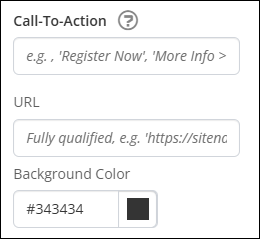
The following settings are available for Call-To-Action:
- Call-To-Action - Define the label for the Call-to-Action button.
- URL - Define the URL for the Call-to-Action button.
- Background Color - Set the button's background color.
Getting Started Button
The Getting Started button in the top right corner links to the Getting Started page, which contains suggestions, product tours, and helpful tips on how to start using TopClass. Find the settings for the Getting Started button on the Image tab of the Header Settings.
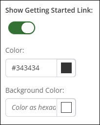
The following settings are available:
- Show Getting Started Link - Toggle off to hide the Getting Started button.
- Color - Select the button's text and border color.
- Background Color - Select the button's background color.