Utility Navigation
The Utility Navigation content item is used to display the service and account options. In the out-of-the-box Member site, most of these options appear at the top of the page:
- Sign in/out - Use this option or the Account area, but do not use the options together.
- Navigation links - Includes a link to the user's profile and a link to the Cart.
- Universal search
- Translation
- Easy edit
- Account area - Includes the user drop-down and the On behalf of button. The Account area includes a sign in/out link. If you are using this option, do not use the Sign in/out option.
- Navigation toggle - Used for implementing a responsive site. This allows the navigation to shrink down into a button for smaller screen sizes.
- On behalf Of
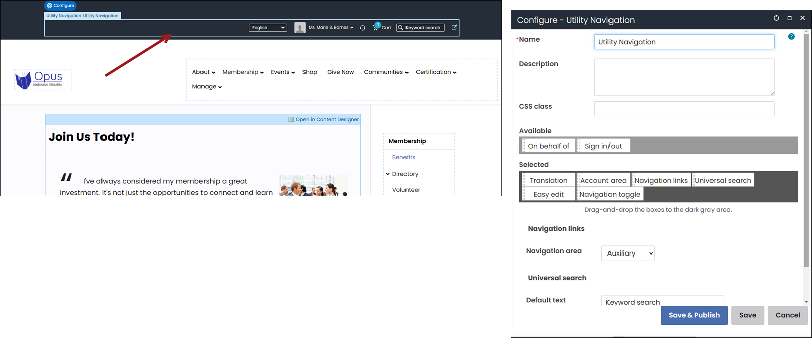
Utility Navigation configuration options
- Name - Enter a name for the content item.
This text appears during design mode (configuration). - Description - Enter a description to display above this content item on the rendered page. The maximum length is 5000 characters. If blank, no description displays. This field supports HTML and relative file paths using the following variables:
- [Website] and [@] – Both variables resolve to the root of the website and contain the website name. For example, [Website]Home.aspx resolves to http://example/Staff/Home.aspx.
- [~] and [Root] – Both variables resolve to the root of the website. For example, [~]Home.aspx resolves to http://example/Home.aspx.
- [Common] – Resolves to the AsiCommon directory of the website. For example, [Common]images/image.png resolves to http://example/AsiCommon/images/image.png.
- [iMIS] – Resolves to the iMIS directory of the website. For example, [iMIS]images/image.png resolves to http://example/iMIS/images/image.png.
- [Theme] – Resolves to the website’s theme folder. For example, [Theme]images/image.png might resolve to http://example/App\_Themes/Orion/images/image.png. This variable can be used to access theme resources such as images and CSS.
- CSS class (optional) - Enter the name of a CSS class to associate with
this content item, which will add a DIV so named around the content item. Add this CSS class to an appropriate
style sheet. Using such classes lets you apply special formatting to targeted content items in a reusable way. - Available - The remaining available utility controls.
- Selected - The utility controls accessible to users.
Utility controls
-
Account area - From the Staff site, this displays as a user account drop-down.
This drop-down contains On behalf of, My account, Sign out, and links to other active websites. From member-facing
websites, the logged-in user's full name displays as a hyperlink. -
Navigation links - Displays the links specified by Navigation area.
-
Navigation area - Each Website Navigation Item can be configured to only display
in a particular navigation area of the website.
For example, you might only want the shopping cart to display in the auxiliary navigation.
You can select which navigation area to display. All Website Navigation Items with the
Navigation area you select will appear on each page. -
Easy edit - Displays the Easy edit icon.
-
Sign in/out - Displays the Sign in or Sign out link.
-
Sign in text - Enter alternate text to display instead of Sign in.
-
Sign out text - Enter alternate text to display instead of Sign out.
-
CSS class - Enter a CSS class to apply to this link. For example, a button class so the link
displays as a button. -
Translation - Displays the translation drop-down. This option will only appear if you are
licensed for translation. -
Universal search - Displays the site search bar.
-
Default text - Enter the text you want initially displayed in the search bar.
-
CSS class - Enter a CSS class to apply to the search bar.
-
Navigation toggle - Will display the primary navigation in a hamburger toggle for certain screen sizes if you
are using a responsive template. If there is no Primary Navigation content item on the page, this option has no impact. -
On behalf of - Will display a link to select a user to go on behalf of for product purchases or event registrations. This
will only appear for users who have on behalf of permissions.