

Dynamic Content Items
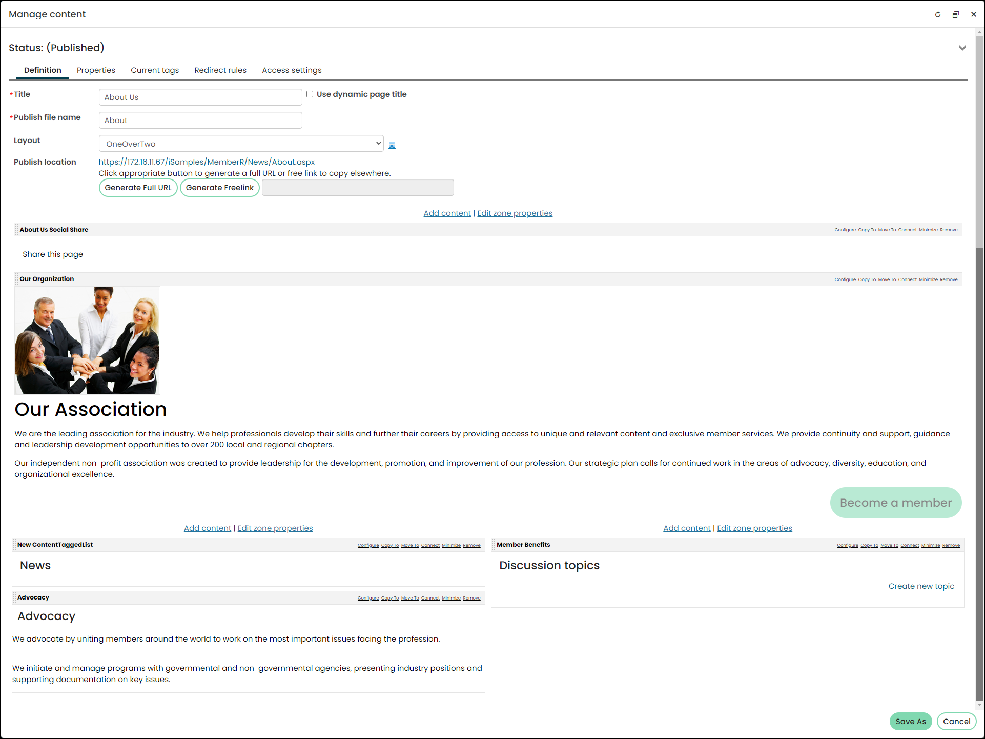
iMIS Dynamic Content Items, also known as iParts, are unique components that can be placed together on content pages of your iMIS sites that you build with RiSE. This section helps you to understand how to present attractive and dynamic content to your users.
A Dynamic Content Item is an iMIS-specific web part that represents a building block of features that you can place on a content record with other building blocks to create new pages of features. Multiple content items can be combined and displayed in a content record as you prefer.
Default Dynamic Content Items appear throughout iMIS. You can modify them for your needs and you can reuse content items throughout the system. For example, a content item displaying a roster for a Membership Group can follow the same user behavior patterns as a content item for a roster in Events.
Common content item configuration options
Many content items share a set of common configuration options. Each of these content items shares the following configuration options:
- Name - Enter a name for the content item.
This text appears during design mode (configuration). - Title - Enter the text to display above this
content item on the rendered page. If blank, no title displays. - Heading level - Select a header level to be applied to the content item Title. For example a value of 1 will apply an H1 element to the Title. The default is 2. None applies the default value (2).
- Description - Certain content items allow a description that will display above the content item on the rendered page. The maximum length is 5000 characters. If blank, no description displays. This field supports HTML and relative file paths using the following variables:
- [Website] – Resolves to the root of the website and contains the website name. For example, [Website]Home.aspx resolves to http://mydomain/Staff/Home.aspx.
- [Root] – Resolves to the root of the website. For example, [Root]Home.aspx resolves to http://mydomain/Home.aspx.
- [Common] – Resolves to the AsiCommon directory of the website. For example, [Common]images/image.png resolves to http://mydomain/AsiCommon/images/image.png.
- [Theme] – Resolves to the website’s theme folder. For example, [Theme]images/image.png might resolve to http://mydomain/App\_Themes/Orion/images/image.png. This variable can be used to access theme resources such as images and CSS.
- Do not render in design mode - Select this option
to prevent content record data from being loaded in the content editor.
This improves performance during design time (configuration). - CSS class (optional) - Enter the name of a CSS class that
will be applied to the content item at runtime. Add this CSS class to an appropriate
style sheet. Using such classes lets you apply special formatting to targeted
content items in a reusable way. - Display a border around this content - Select
this option to display a border around this content item on the rendered page. - Display content within a collapsible panel - Enable
to allow users to minimize the panel within the page, to work with dense pages more efficiently.- Show the content as collapsed - Enable to display the panel minimized by default.
Note
Be sure that the Title above makes clear what data is hidden from view.- Display on screen sizes (for responsive themes only):
-
Extra-small screens - When disabled, this content item is
hidden on extra small devices, such as smartphones, where the width of the
screen is less than 768px. -
Small screens - When disabled, this content item is hidden on
small devices, such as tablets, where the width of the screen is greater than
768px and less than 991px. -
Medium screens - When disabled, this content item is hidden on
medium devices, such as laptops, where the width of the screen is greater than
992px and less than 1199px. -
Large screens - When disabled, this content item is hidden on
large devices, such as wide computer monitors, where the width of the screen is
greater than or equal to 1200px wide.NoteWhen Easy Edit is enabled, all content items for a
page are displayed, regardless of the Display on screen sizes (for
responsive themes only) options that are selected.
- Show the content as collapsed - Enable to display the panel minimized by default.


For more information, as well as additional configuration options, see the related content-item gallery.
Updated 5 months ago