

Panel Editor
Panels are custom displays of data that you are able to name, build, arrange in grids, and add to your site. Using panels, your users can browse, edit, add, and delete their data, as you specify.
For more information, see Panel Designer.
Panel Collection Editor configuration options
This content item uses the Common content item configuration options, in addition to the following:
- Panels - Choose the panels to include in the collection. The panels are added in alphabetical order, each appearing on their own tab. Only staff users can view and edit panels with a Parent type of Standalone.
- Limit users who can view data - (Does not apply to Standalone panels) If this option is enabled, only authorized users can view information for contacts other than themselves. This prevents other users from changing the ID in the URL to access another contact's data. Authorized users include staff and Company Administrators for a group that the contact belongs to. Disable this option to allow all users to view information for other contacts, such as for a public profile. If this option is disabled, the system security settings determine whether a user must be logged in to view information for other contacts.
Multi-instance panel options
The following options are only available when a multi-instance panel is selected:
- First column sort order:
- Ascending or Descending - Determines how the first column in each panel is sorted.
- Limit grid size - Select this checkbox to set a height and width for a multi-instance panel.
- Grid width - Enter the width in pixels.
- Grid height - Enter the height in pixels.
- Enable scrolling for cells - Select this checkbox to enable a vertical scrollbar for cells whose values are greater than 100 characters.
- Allow users to delete - Select this checkbox to enable users to delete their data from a multi-instance panel.
All panel-type options
The following options are available when any panel type (single or multi-instance) is selected:
-
Allow users to edit - Enables people to edit the current data in the panel.
-
Open single-instance panels in edit mode by default (available if Allow users to edit is selected) - Select this checkbox to always display a single-instance panel in edit mode for website users who have permission to edit the panel data.
NoteIf your panel is incorporated into a wizard and has required fields, then Open single-instance panels in edit mode by default must be enabled. If this option is not enabled, users are able to skip required fields.
-
Save buttons - Define where you want the panel's Save button to appear:
-
Use page-level buttons (bottom of page) -
The Save button for the specified panel is located at the bottom of the page.
This panel-specific configuration option allows you to edit multiple panels, then perform a mass save of the various panels.
NoteIf there are multiple panels on a page, only panels configured with this option are
saved upon selecting the Save button at the bottom of the page. Other panels configured with the Include in panel save button are only
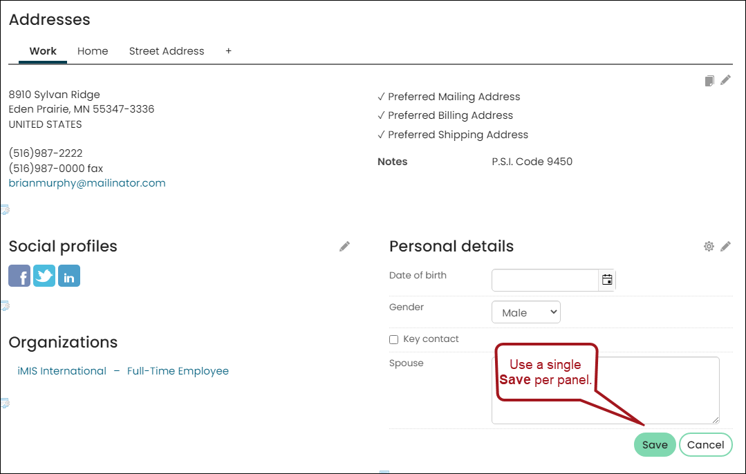
saved after their panel-specific Save button is clicked.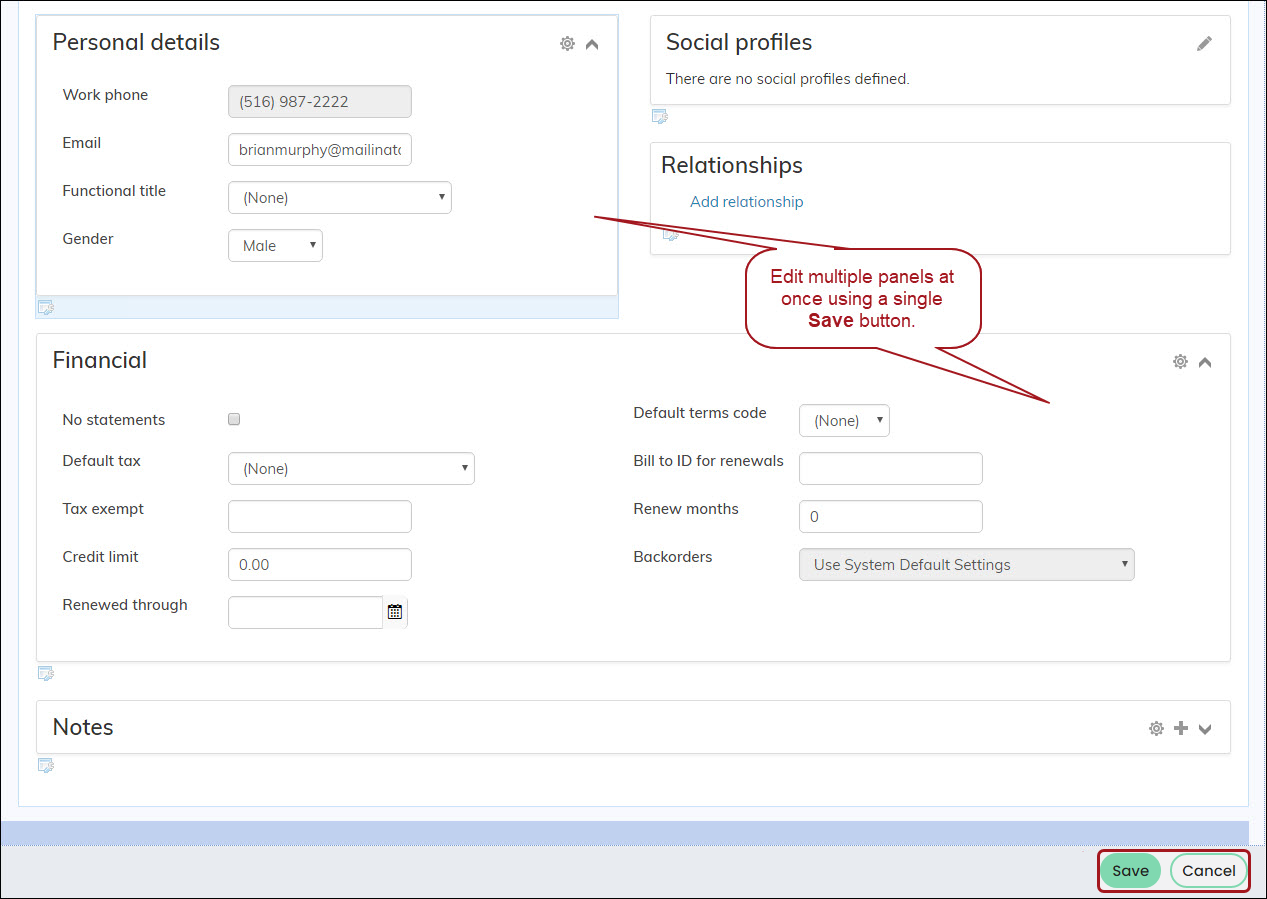 - Include in panel - The Save button is located
in-line with the panel. This allows you to save content on a per-panel basis.
-
-
Commit sequence (available if Open single-instance panels in edit mode by default is selected) - Allows you to explicitly define the execution order of multiple content items in a content record. The number in this field indicates
the processing order for this content item, relative to the other content items in the same content record. The value must be 0 or greater. You can
leave the default value of 0 if the execution order of content items is not a concern. Content items with a value of 0 are processed after
any other content items with a non-zero Commit sequence value that are on the same content record.
-
NoteThe Open single-instance panels in edit mode by default option displays only as a configuration option when a single-instance panel is selected.
- Edit window width - Enter the default width, in pixels, of the pop-up edit window for a multi-instance panel.
- Edit window height - Enter the default height, in pixels, of the pop-up edit window for a multi-instance panel.
NoteThe Edit window width and Edit window height options display only when the Panel Editor is configured to Allow users to edit for a multi-instance panel.
Notes
-
Refreshing other panels on the content record - You can connect panel-displaying content items on the same content record so that they
dynamically refresh each other after user editsDo the following to create a connection:
- Edit the content record.
- Click Connect on the content item. A Connect window is displayed.
- Click Create a new connection.
- Create an Object Consumer connection.
- Select a panel content item from the Object Provider drop-down.
- Click Connect.
- Click the red X to close the Connect window.
-
When a Panel Editor content item in a contact’s public profile is configured to
open in edit mode by default, the panel still displays in read-only mode for
unauthenticated users who have access to the contact. The panel does not display
to unauthenticated users who do not have permission to view the contact.
Panel Editor configuration options
A majority of the configuration options that appear in Panel Editor depend on what is chosen from the Panel drop-down. In addition to the common configuration options, the following configuration options appear for all panels:
- Panel - Select a pre-existing panel or create your own by selecting (New panel). The Panel drop-down is sorted by the Parent type of the panel. Only staff users can view and edit standalone panels.
NoteYou do not have to republish the content item to see panel changes; panels are stored separately from content records.
- Limit users who can view data - (Does not apply to Standalone panels) This option applies to both contact and group panels. If this option is enabled,
only authorized users can view information for contacts in contact panels other than themselves and view group information for the groups the viewer is authorized in. This prevents other users from changing the ID in
the URL to access another contact's and group's data. Authorized users include staff and Group Member Administrators for a group that the contact belongs to.
Disable this option to allow all users to view information for other contacts in contact panels, such as for a public profile. Disable the option to allow all users of a specific group to view the information in the group panel. If this option is disabled,
the system security settings determine whether a user must be logged in to view information for other contacts. - Hide panel when there is no data to display - When enabled, the panel is hidden if both of the following are true:
- The panel contains no data;
- And, the panel is not available for edit by the logged in user (Allow user to edit is disabled)
The remaining configuration options depend on whether you choose to create a new panel or if you selecting a pre-existing panel that is single-instance or multi-instance:
(New panel)
A new window appears when (New panel) is selected. The following configuration options are available:
- Panel name - Identify the panel for administrators. The panel name does not appear on the displayed page.
- Panel description - (optional) Explain the panel for administrators. The panel description does not appear on the displayed page.
- Parent type - Select the type of panel you want to create:
- Contact – Associates the table data with a specific contact. These are the panels you put on user account pages to display data that is specific to each contact.
- Groups - Associates the table data with a specific group type. These are the panels you put on a group page to display data that is specific to each group.
Event - Associates the table data with a specific event. Panels can include properties for resources, sponsors, hotels/venues information, or any data you want a value list for. Panels associated with events results in creating panel sources such as tables and business objects that have a column for EventKey. An EventKey is a unique value used to join a business object to other panel data sources and business objects in IQA that represent events. For event panels, an EventKey is automatically generated for the business object that represents the panel data source.
- Standalone - Does not associate table data with a specific contact. Standalone panels are multi-instance only and can be used anywhere in iMIS. These panels are useful for anonymously tracking information or creating a multi-instance form. See Creating standalone panels for more information.
- Panel type - Specify the panel’s type. The Panel type you choose determines which panel sources appear.
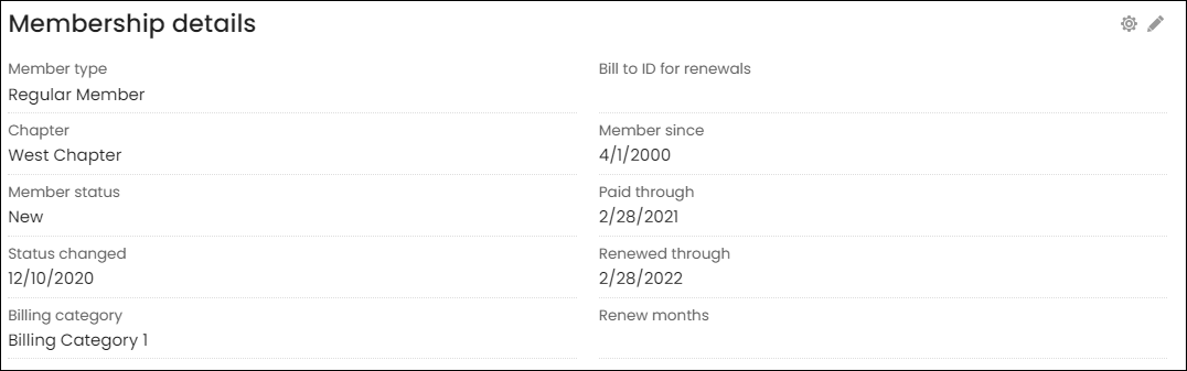
- The Membership details panel located on the Overview and Membership tab of contact account pages.
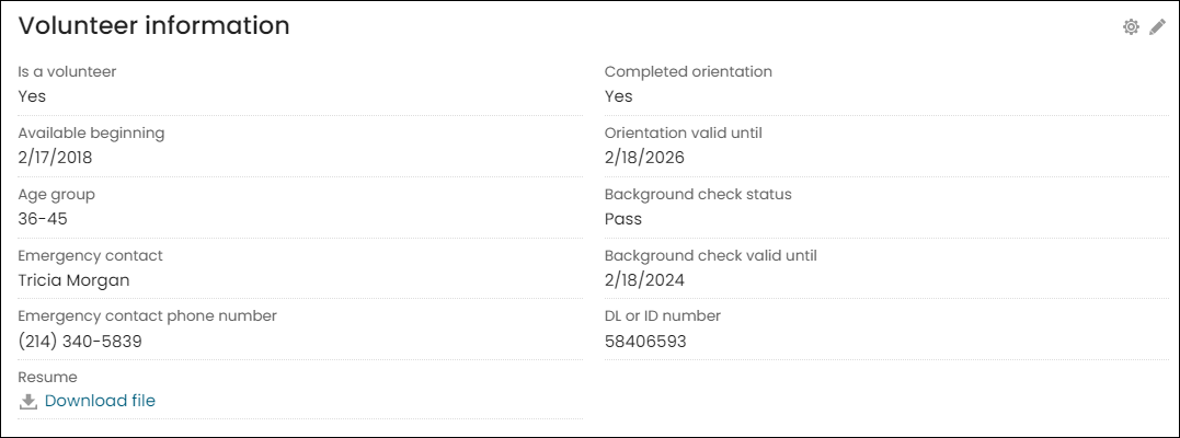
- The Volunteerinformation panel located on the Volunteering tab of contact account pages.
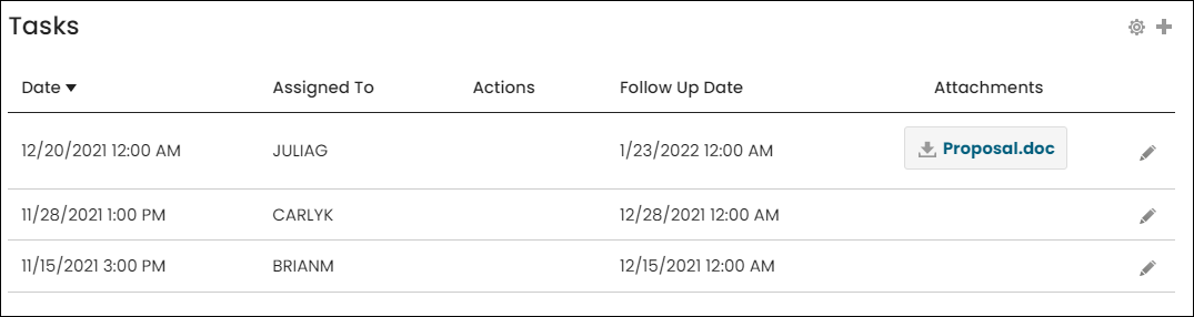
- The Tasks panel located on the Overview tab of contact account pages.
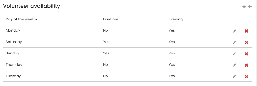
- The Volunteer availability panel located on the Volunteering tab of contact account pages.
- [+] [-] - (optional) Use these icons to add or remove columns. Click the plus-sign icon to add up to two more columns. If the right-most column is empty when you select OK, the column is removed from the layout.
For Contact panels, an ID is automatically generated for the business object that represents the panel data source. The ID is a unique value used to join the business object to other panel data sources and business objects in IQA. It is also used as the iMIS ID for linking in IQA.
For Group panels, a GroupKey is automatically generated for the business object that represents the panel data source. The GroupKey is a unique value used to join the business object to other panel data sources and business objects in IQA.
All other properties and single and multi-instance panels can be used when created event-based panels.
📘 Note
When using the Bill to ID property, it is recommended you use CsContact.BillToId instead of CsNameFin.Bt ID.
📘 Note
Only staff users and system administrators can create, edit, view, and delete standalone panels. Public users cannot view standalone panels, and as a result, standalone panels should not be added to any public-facing content records.
Click for details
Single-instance
Single-instance panels allows for one entry per panel property and contain properties that can have only one value. The following are out-of-the-box examples of single-instance panels:
Multi-instance
Multi-instance panels allow multiple entries for a single panel property and contain properties that typically have multiple entries for a single value, such as employment history, emergency contacts, or skills and interests. See Creating a panel that allows multiple entries for more details about multi-instance panels.
The following are out-of-the-box examples of multi-instance panels:
Layout area:
- Label - Edit the default text for each field, to make it shorter or more user-friendly.
- Label position - Choose the field label position. There are two options - Left and Top (default).
- Read-only - Enable on those fields for which you want to prevent user updates. This option only applies if you have enabled Allow users to edit or Allow users to add.
- Required - Enable on those fields for which you require completion of a field (such as providing data) or have a required action.
- Hide in summary view - Enable on non-critical fields that you want to make available only in the full pop-up view.
📘 Note
Labeling is required. If you delete the default label, the content item uses the underlying column name.
Tips:
- Double-clicking adds a field to the first available space in your panel.
- Dragging a field lets you place it elsewhere in the panel.
- Add one field by double-clicking, dragging, or clicking on the plus-sign icon ([+]) to the left of each node in the hierarchy. Each node is an available table, and its fields expand below the node. If no plus-sign icon ([+]) is available, all of the table's available fields are already added to your panel.
- Add a whole table by dragging or double-clicking a table name. If you have already added fields from that table, the remaining fields are added without duplication. Fields appear in the first available space in your panel, until the space is used up.
- Add fields from different nodes to combine fields from different single-instance tables.
- Arrange fields by dragging within the layout preview area. Leave empty cells where you want white space to appear within the panel.
- Remove a field - Click the X button. The field returns to the hierarchical control, from which you can select it again.
- Remove a column - Click the minus-sign icon ([-]) to the right of the layout area; the right-most column is removed.
Single-instance panel
The following options are available if the chosen Panel is a single-instance panel:
-
Allow users to edit - Enables people to edit the current data in the panel.
- Open single-instance panels in edit mode by default (available if Allow users to edit is selected) - Select this checkbox to always display a single-instance panel in edit mode for website users who have permission to edit the panel data.
- Save buttons - Define where you want the panel's Save button to appear:
- Use page-level buttons (bottom of page) - The Save button for the specified panel is located at the bottom of the page. This panel-specific configuration option allows you to edit multiple panels, then perform a mass save of the various panels.
- Include in panel - The Save button is located in-line with the panel. This allows you to save content on a per-panel basis.
📘 Note
If there are multiple panels on a page, only panels configured with this option are saved upon selecting the Save button at the bottom of the page. Other panels configured with the Include in panel save button are only saved after their panel-specific Save button is clicked. - Commit sequence (available if Open single-instance panels in edit mode by default is selected) - Allows you to explicitly define the execution order of multiple content items in a content record. The number in this field indicates the processing order for this content item, relative to the other content items in the same content record. The value must be 0 or greater. You can leave the default value of 0 if the execution order of content items is not a concern. Content items with a value of 0 are processed after any other content items with a non-zero Commit sequence value that are on the same content record.
📘 Note
If your panel is incorporated into a wizard and has required fields, then Open single-instance panels in edit mode by default must be enabled. If this option is not enabled, users are able to skip required fields.
Multi-instance panel
Multi-instance panels allow users to enter multiple items for a single property. For example, you could allow your users to enter more than one degree in an Education panel. See Creating a panel that allows multiple entries for more information.
Standalone panels are only multi-instance and available to staff users to view, add, edit, and delete. Public users do not have permissions to view a standalone panel, and as a result, should not be added to public-facing content records.
The following options are available if the chosen Panel is a multi-instance panel:
- First column sort order - Enable to sort the first column of your panel in Ascending (default) or Descending order. When enabled in the Panel Collection Editor, this option applies to all multi-instance panels within the collection.
-
Limit grid size - Select this checkbox to set a height and width for a multi-instance panel. If the panel exceeds the set dimensions, scrolling is enabled.
- Grid width - Enter the width in pixels.
- Grid height - Enter the height in pixels.
- Enable scrolling for cells - Select this checkbox to enable a vertical scrollbar for cells whose values are greater than 100 characters.
- Allow users to add - Select this checkbox to allow users to add to the panel.
- Allow users to delete - Select this checkbox to enable users to delete their data from a multi-instance panel.
-
Allow users to edit - Select this checkbox to allow users to edit the current data in the panel.
- Edit window width - Enter the default width, in pixels, of the pop-up edit window for a multi-instance panel.
- Edit window height - Enter the default height, in pixels, of the pop-up edit window for a multi-instance panel.
Notes
-
Refreshing other panels on the content record - You can connect panel-displaying content items on the same content record so that they
dynamically refresh each other after user edits.Do the following to create a connection:
- Edit the content record.
- Click Connect on the content item. A Connect window is displayed.
- Click Create a new connection.
- Create an Object Consumer connection.
- Select a panel content item from the Object Provider drop-down.
- Click Connect.
- Click the red X to close the Connect window.
-
Single-instance tables can have multiple entries, but they allow only one entry per instance of a parent object.
-
The Allow users to delete option is disabled by default. If you choose to enable this option, it will be reset to disabled upon upgrade.
-
When a Panel Editor content item in a contact’s public profile is configured to
open in edit mode by default, the panel still displays in read-only mode for
unauthenticated users who have access to the contact. The panel does not display
to unauthenticated users who do not have permission to view the contact.
Updated 5 months ago