

Using out-of-the-box themes
You can change the look and feel of the Quick Start Sites by selecting a different Website theme. Each out-of-the-box website theme is automatically paired with a website template. Selecting a new out-of-the-box theme automatically selects the correct correlating template. If you want to modify a particular design for your website, make sure you create a copy of the Website theme before making any changes.
NoteiMIS themes give you a head start on developing your website. To provide you an idea of how things could look, we have used numerous pictures, illustrations, and images that we purchased under a limited license for ASI's use. The icons can be used on your website, but if you reuse any of the other images, you will need to buy a license. We acquire the majority of our images from iStockPhoto and most are available in the range of $15-$50, which is much less than the cost and labor of creating them on your own. If you have any questions, please contact us.
Staff site themes
These website themes were created specifically for staff site functionality, and should not be used with member-facing websites:
Orion
Orion is the website theme applied to your out-of-the-box Staff site. Although Orion is a responsive Staff site theme, RiSE, Reports, and Manage communication templates were not designed to be responsive on mobile devices. The template used with this website theme is Constellations.
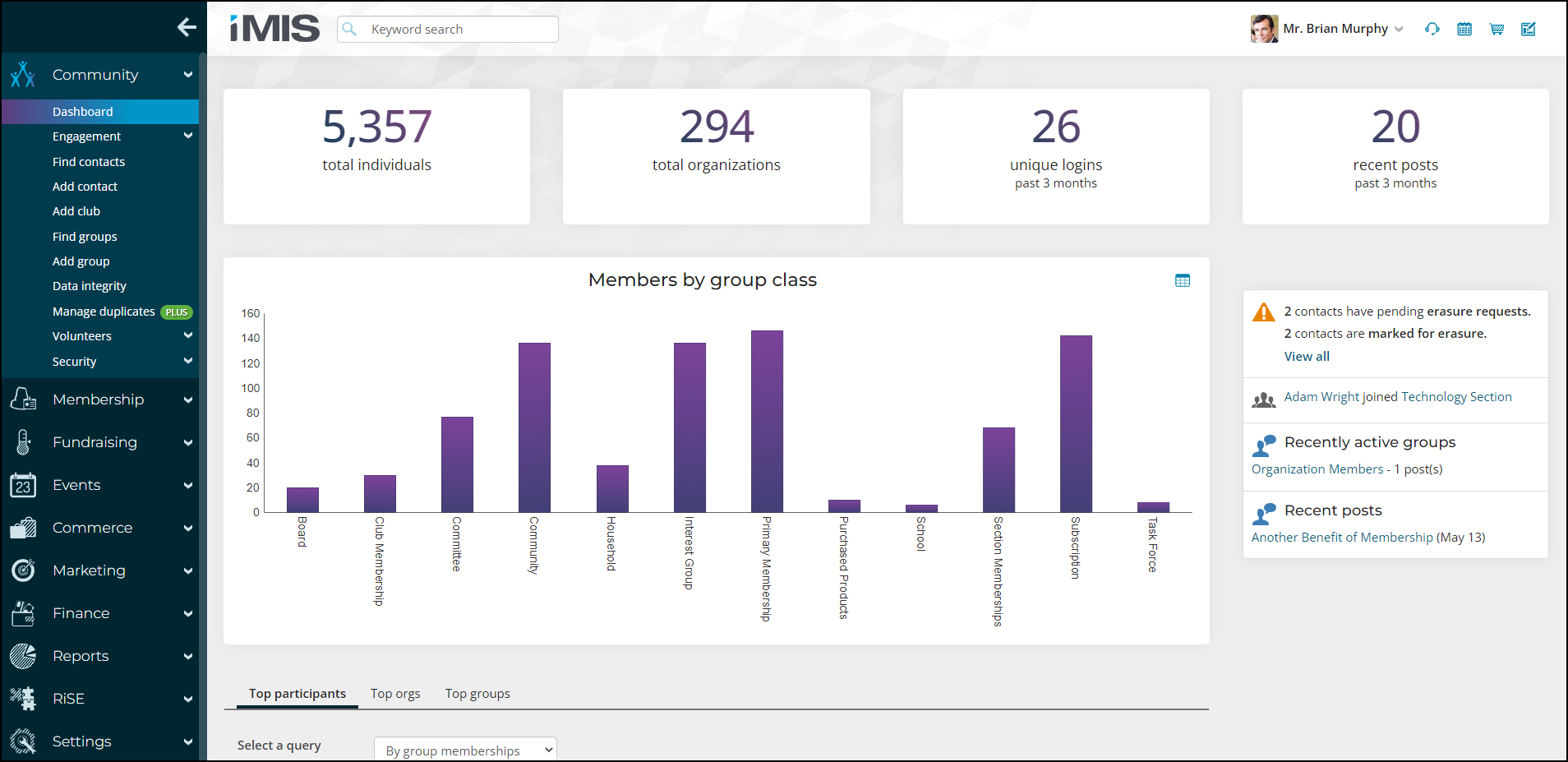
The navigation for Orion is collapsible, allowing staff users to utilize the horizontal space of the screen. When collapsed, staff users can hover over the navigation icons to continue navigating through the Staff site. Clicking the navigation toggle (hamburger icon) keeps the navigation expanded, while clicking the arrow icon keeps the navigation collapsed. The navigation toggle is the only available option when the screen resolution is 992px or less.
The navigation setting (expanded or collapsed) is saved in the browser's local storage (localStorage), so until the cache is cleared, the staff user's selection of either expanded or collapsed is remembered each time they log out/in from the Staff site.
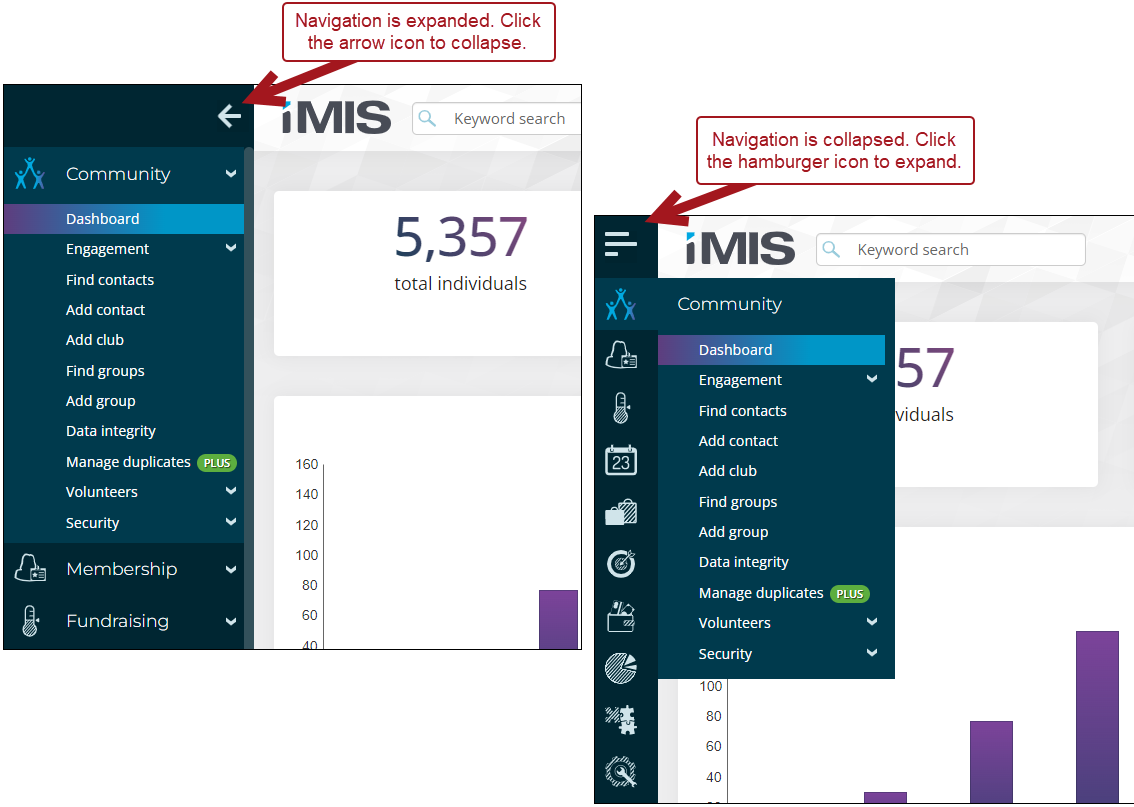
The Orion sitemap navigation icons are powered through out-of-the-box CSS classes. Review the following chart to see the available icons.
| Icon | CSS class |
|---|---|
 | CommunityLink |
 | MembershipLink |
 | FundraisingLink |
 | EventsLink |
 | CommerceLink |
 | AdvertisingLink |
 | MarketingLink |
 | EducationLink |
 | FinanceLink |
 | ReportsLink |
 | RiSELink |
 | SetupLink |
 | BuildingLink |
 | CallLink |
 | LightbulbLink |
 | EmailLink |
 | PersonLink |
 | CheckInLink |
 | FoldersLink |
 | HelpLink |
 | SupportLink |
 | NotepadLink |
 | WebsiteLink |
 | TreeviewLink |
 | TrainingLink |
 | ProcessLink |
 | OpenWaterLink |
Use any of the above icons in the top-level navigation by updating the CSS class:
-
Go to RiSE > Site Builder > Manage sitemaps.
-
Choose Staff from the drop-down.
-
Select the navigation item.
-
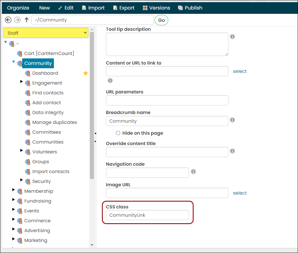
(Properties tab) Update the CSS class field to contain the desired CSS class.
-
Click Save.
-
Click Publish.
Public-facing site themes
The following themes were designed to be implemented on public-facing sites. For example, a member or donor site. The responsive themes were built to work best with responsive websites, such as the Member Responsive Quick Start Site. The themes without Responsive in the title were not built to be responsive.
Responsive themes
Austin Responsive
Similar to the look and feel of the Austin theme, Austin Responsive is visually appealing on mobile, and other hand-held devices. This website theme uses the Cities Responsive template.
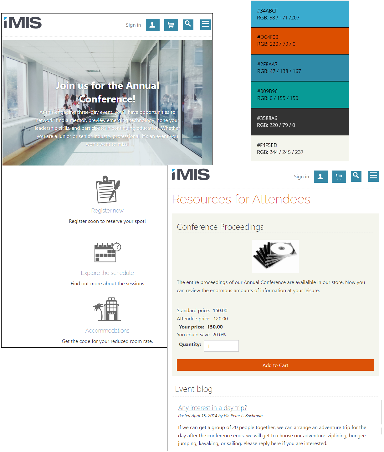
Austin Mobile
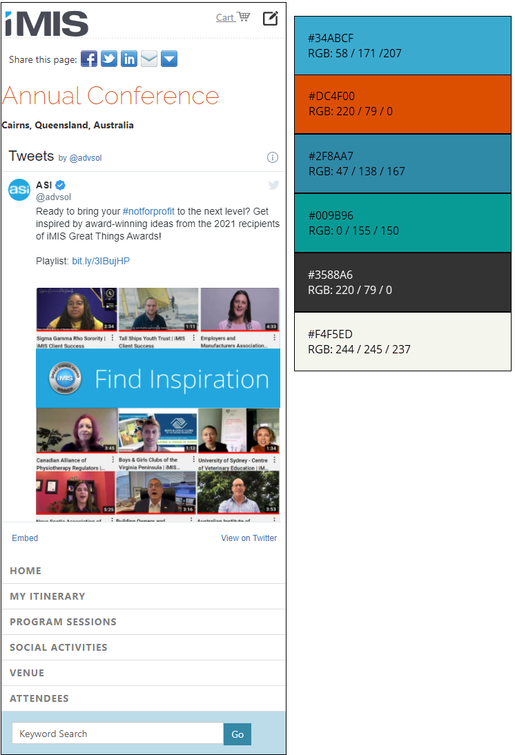
This theme home page looks the same whether a member is logged in or not. The template used with this theme is Sapling.
Flat White
This website theme uses the Coffee template.
Flat White features a clean, toned-down style, providing a contemporary and professional appearance. Some of the home page content is animated, such as the top navigation fading in or the cards flipping as you scroll down the homepage.
This theme comes with a JavaScript library called AOS.js (animate-on-scroll), which allows the page elements to be animated. You can apply the animated attributes to any page layout to add additional animation. The animated attributes utilized in the Flat White theme can be found in the Coffee website layout (RiSE > Theme Builder > Website layouts). To learn more about the different animation attributes available, see the Animate on Scroll Library.
Download the theme files to begin customizing the Flat White theme for your organization.
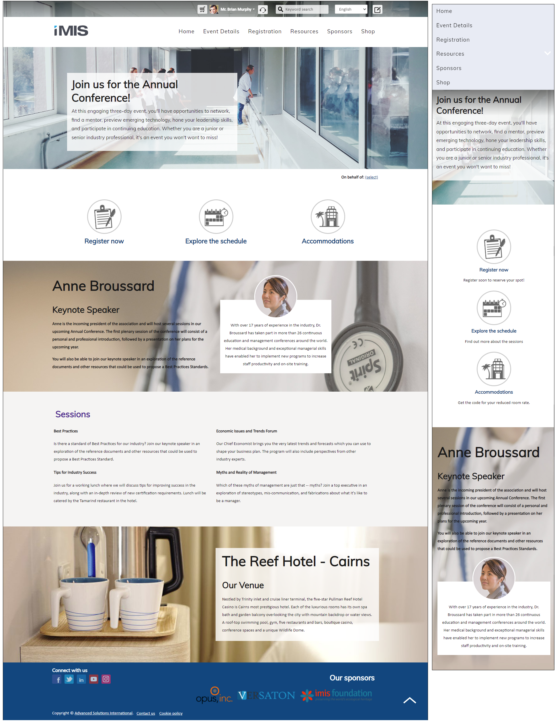
Glacier Bay Responsive
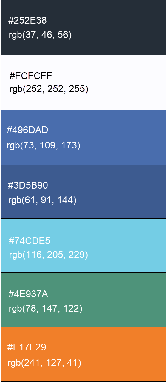
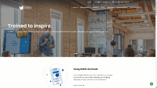
This website uses the WST-NaturalHeritageSitesResponsive template.
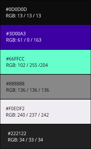
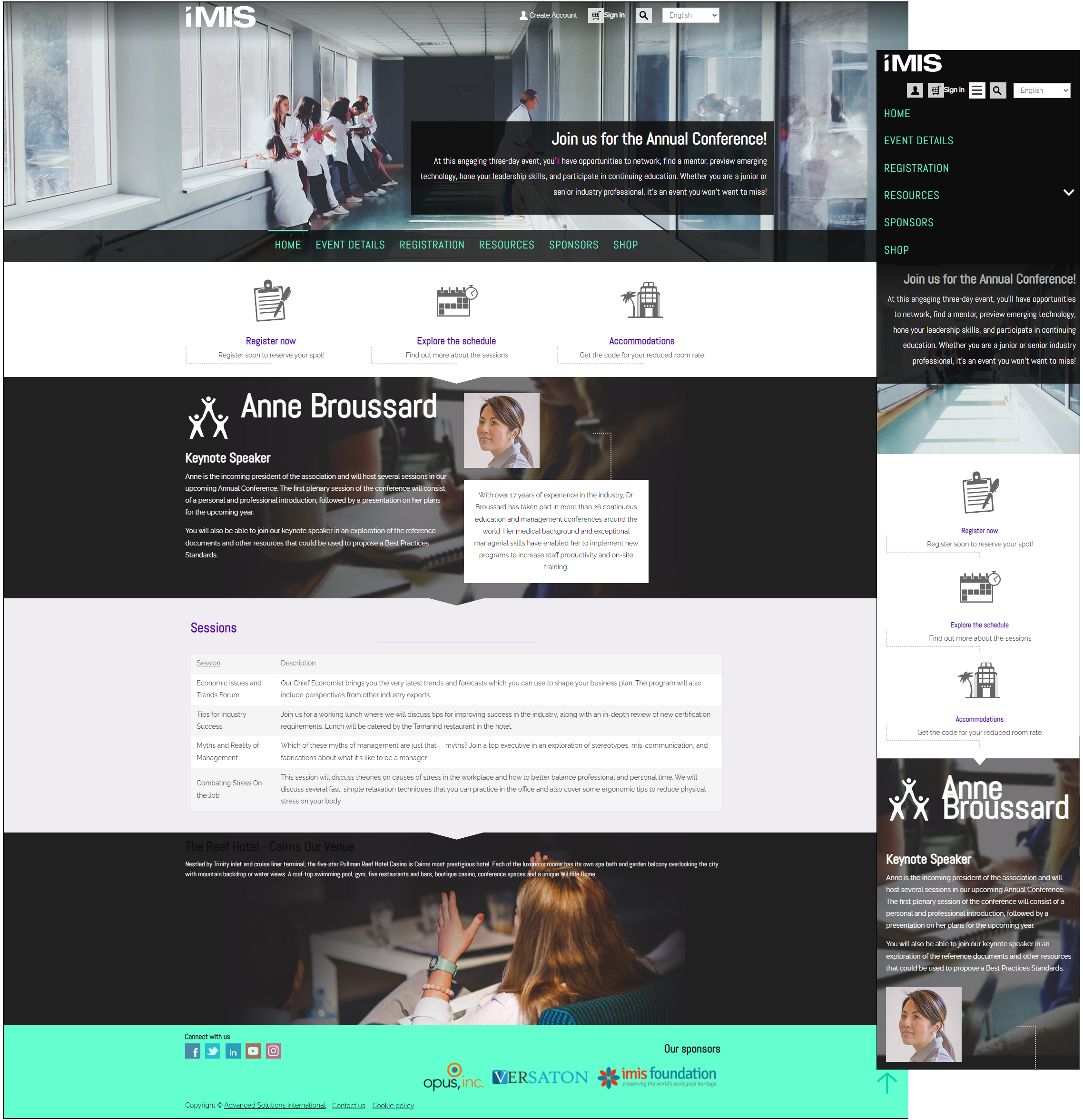
Great Barrier Reef Responsive
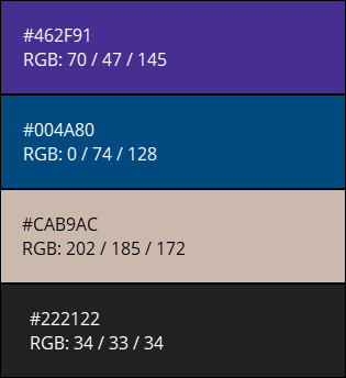
This website uses the WST-NaturalHeritageSitesResponsive template.
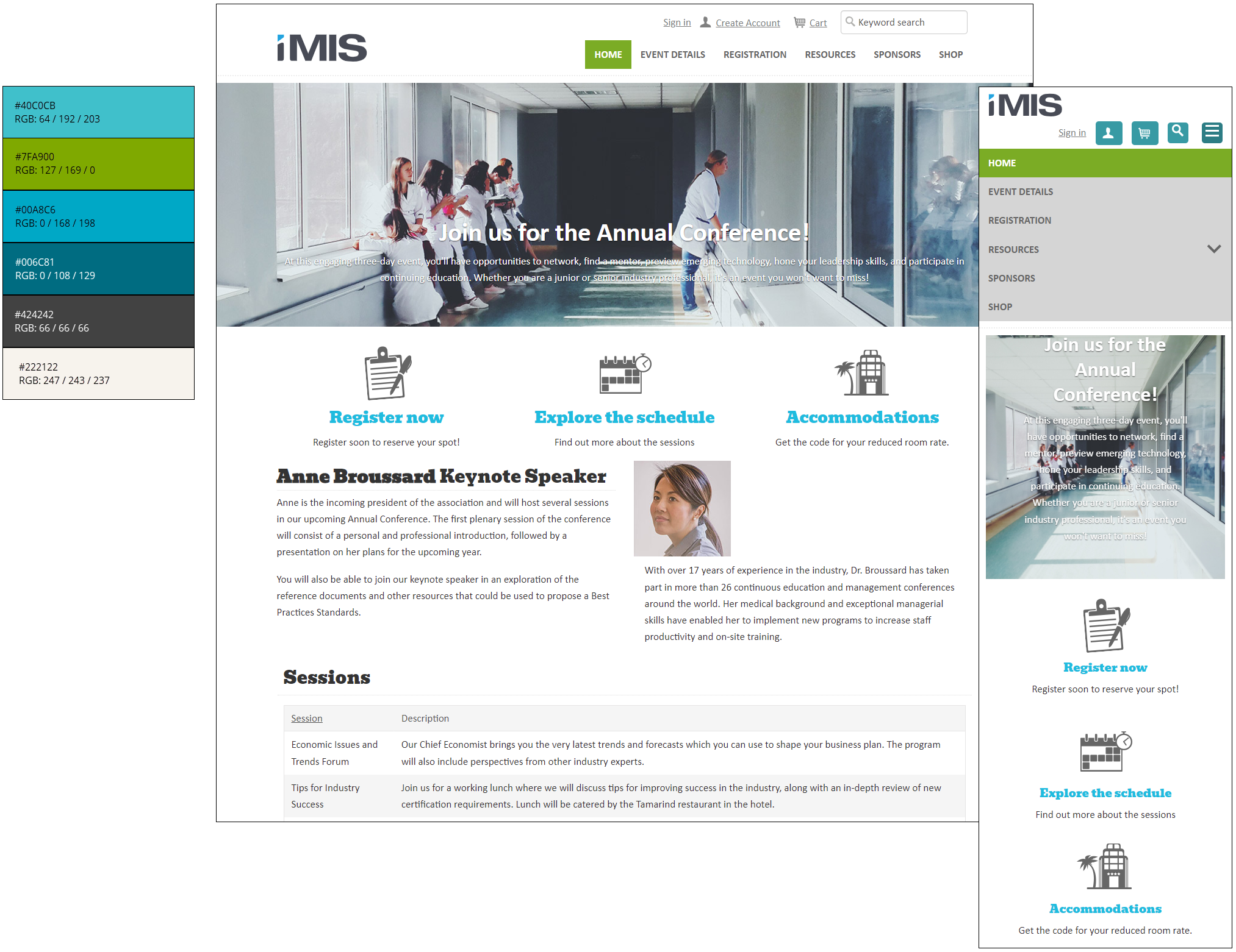
London Responsive
This website theme uses the Cities Responsive template.
Mocha
This website theme uses the Coffee template.
The Mocha theme contains bright colors, organic shapes, and hand-drawn icons. Some of the page's content is animated, such as the top navigation fading in or the cards flipping as you scroll down the homepage.
This theme comes with a JavaScript library called AOS.js (animate-on-scroll), which allows the page elements to be animated. You can apply the animated attributes to any page layout to add additional animation. The animated attributes utilized in the Mocha theme can be found in the Coffee website layout (RiSE > Theme Builder > Website layouts). To learn more about the different animation attributes available, see the Animate on Scroll Library.
Download the theme files to begin customizing the Mocha theme for your organization.
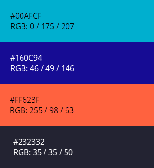
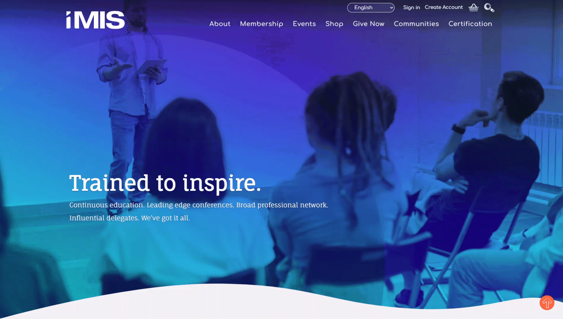
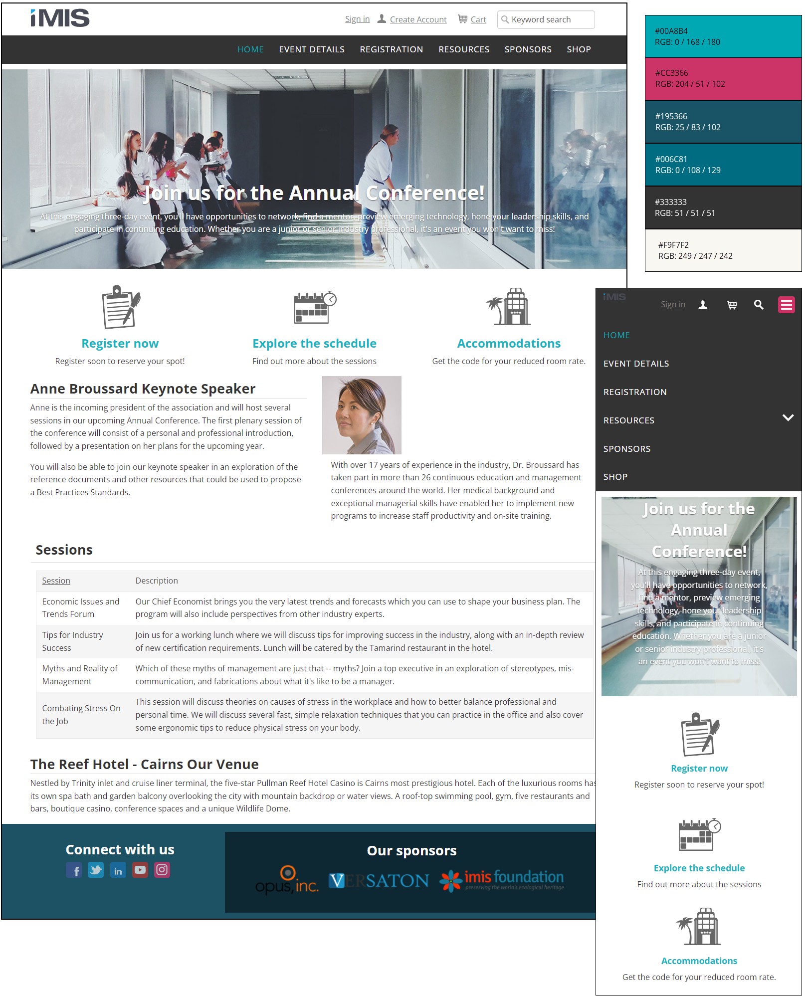
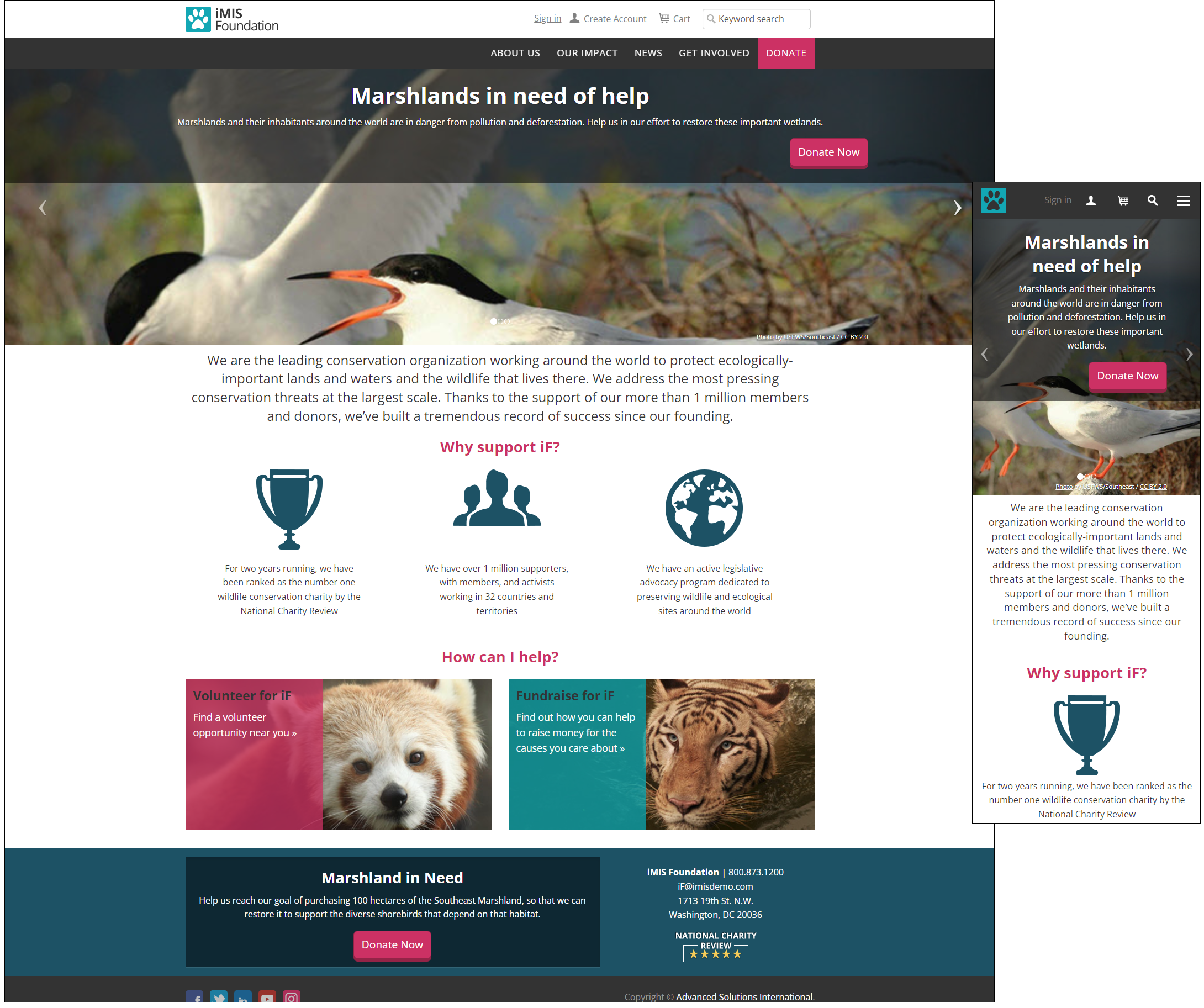
Toronto Responsive
This website theme uses the Cities Responsive template.
Non-responsive
Austin
Although not a responsive theme, this Austin theme has a responsive counterpart, Austin Responsive. This website theme uses the Cities template.
Changing banner images in sample content
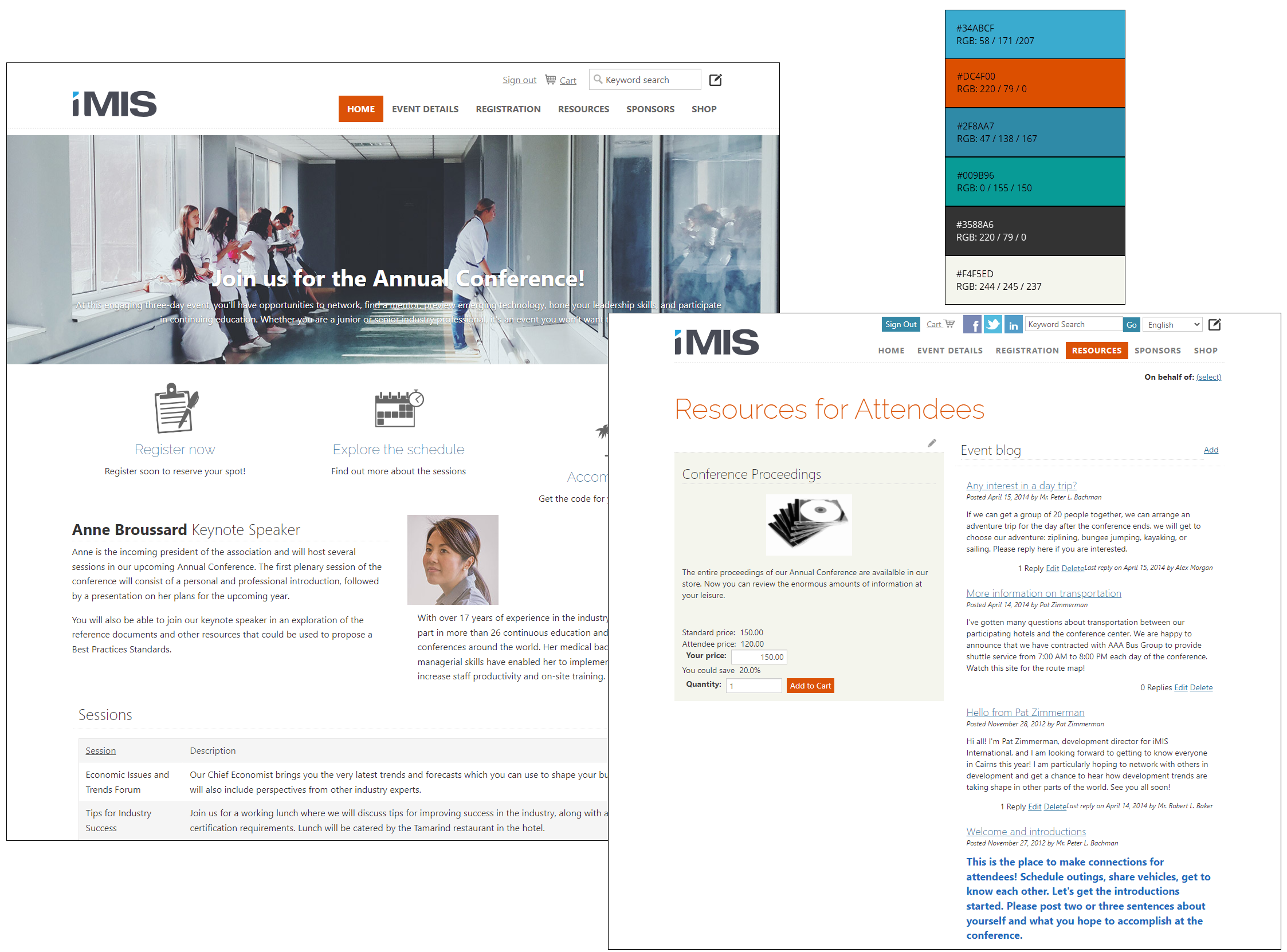
iMIS provides various templates that help control the layout of a website. For example, the Great Barrier Reef Responsive and Glacier Bay Responsive templates include a home page area with a banner stretched across the width of the home page.
If you are using either of these templates, you can copy and modify the Home Page Full Width Area content record to include your organization's unique image and content.
Adding a homepage banner
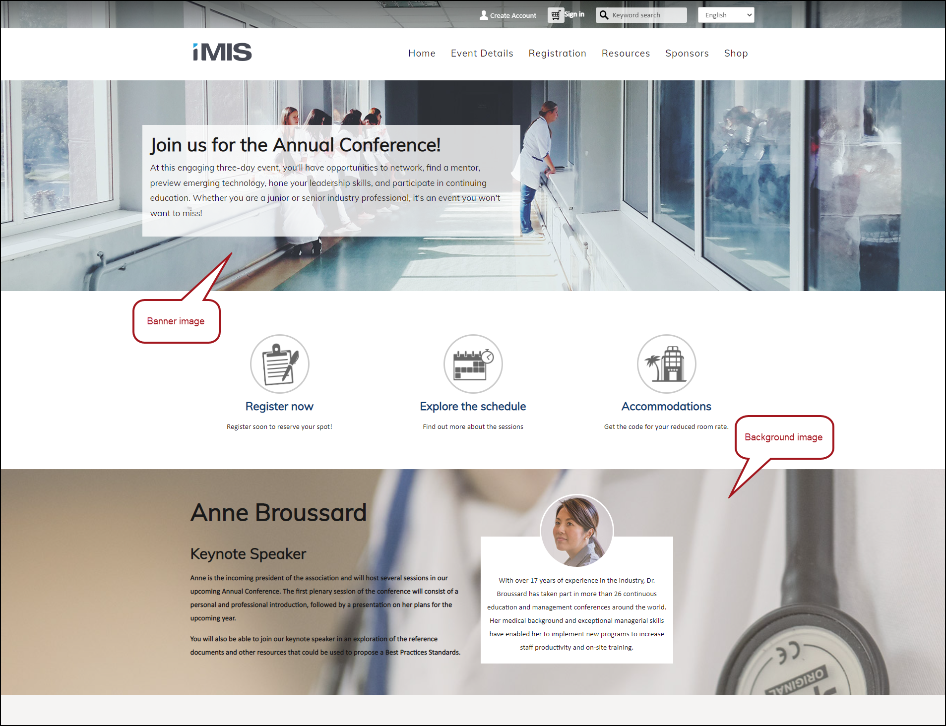
Do the following to add a banner to your home page:
-
From the Staff site, go to RiSE > Page Builder > Manage content.
-
Do one of the following:
- Create the home page using copied sample content:
-
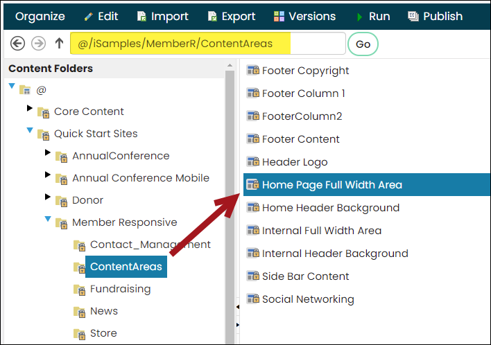
Navigate to @/iSamples/MemberR/ContentAreas.
-
Select Organize > Copy to copy the Home Page Full Width Area content record.
-
Select Organize > Paste to paste the content record to your website's Content Areas folder.
-
- Update an existing home page. Locate the Home Page Full Width Area content record if you are already using a copy of an iMIS Quick Start Site (for example, @/yourwebsite/ContentAreas/Home_Page_Full_Width_Area).
- Create the home page using copied sample content:
-
Select the copied content record and click Edit.
-
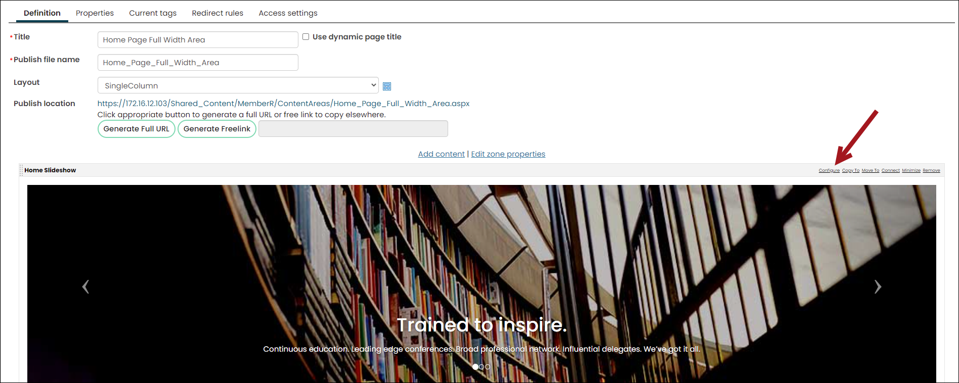
Locate the Slideshow, then select Configure.
-
Select a new Image, and make any other desired changes to the Slideshow.
-
Click Save & Publish. Publishing time can vary depending on the number of slides in the content item.
NoteChoose an image that looks great at very wide resolutions, as the image will always stretch the full width of the browser. For best results, use landscape-sized images (1000-1400 pixels wide).
iMIS sites use various styling elements to create visually appealing websites; part of this process includes using background images. Background images can be changed by using inline styling on the div that correlates to the area that contains the background image.
For example, in the Donor sample site there is content on the home page with animal pictures in the background. You could change the picture by applying a background-image style to the div:
<a href="[website]Get_Involved_/Volunteer/iSamples/Donor/Get_Involved_/Volunteer.aspx"
class="feature-link-with-image feature-link-1"
**style="background-image:url('http://www.mywebsite.com/images/my-background-image.jpg')"**>
TipChoose an image that looks great at very wide resolutions, as the image will always stretch the full width of the browser. For best results, use landscape-sized images (1000-1400 pixels wide).
Updating homepage background banners
There are also background images on the home page of the Member Responsive site when using the GreatBarrierReef_Responsive theme. Do the following to edit these images:
-
Navigate to RiSE > Page Builder > Manage layouts.
-
Make a copy of the Three33-33-33OverOne-FullWidth layout and open your copy.
-
(Code tab) In the Layout code area, change the background image using inline styling on the FullWidthArea
divyou want to change, for example:<div class="FullWidthArea-StyleBg2" **style="background-image:url('http://www.mywebsite.com/images/my-background-image.jpg')"**> -
Click Save.
-
Update the home page of the Member Responsive site to use your modified copy of the Three33-33-33OverOne-FullWidth layout.
Changing the logo, social media links, and copyright statement
The first elements to change on your website are the highly visible elements that public visitors see and use in the header: logo, social media links, and copyright statement.
Logo
The header logo is contained in a content record: @[theme]\ContentAreas\Header Logo. To add your own logo, edit this content record, remove the contents in the Content Html content item, and replace with your own logo.
NoteAlternatively, you can change the logo in the CSS. The logo is set in 99-[theme].css by the selector #masterHeaderImage. Change the background image and the dimensions to match your own logo.
The dimensions in pixels for the out-of-the-box themes are as follows:
- Aspen:
- HeaderLogo - 511 x 55
- HomeBanner - 1400 x 359
- Aspen2:
- HeaderLogo - 491 x 55
- HomeBanner - 1400 x 359
- Birch:
- HeaderBackground - 1400 x 150
- HeaderLogo - 482 x 55
- HomeBanner - 1400 x 424
- Glacier Bay_Responsive
- HeaderLogo - 120 x46
- Great Barrier Reef_responsive
- HeaderLogo - 120 x 46
- Mercury:
- HeaderLogo - 471 x 59
- HomeBanner - 1003 x 320
- Venus:
- HeaderLogo - 458 x 56
- HomeBanner - 1003 x 320
- Mars:
- HeaderLogo - 482 x 55
- Austin, Austin_Mobile, Austin_Responsive, London_Responsive:
- HeaderLogo - 122 x 38
- Toronto_Responsive:
- HeaderLogo - 168 x 46
- Aspen_Mobile:
- HeaderLogo - 100 x 38
- Everest, Orion - Changing the logo on these themes is currently not supported.
The HomeBanner will resize to fit the space, but the width should be at least 1000 px. If you are using the Slideshow content item, the height should be the same as the Height (px) configured in the content item.
Social media links
The links to the social networking sites in the top (auxiliary) navigation are also defined in a content record: @[theme]\ContentAreas\Social Networking Images.
To change the links to navigate to your own social networking pages, edit the content record and change the links on the icons.
In the HTML editor, replace the href on each <a> tag with the appropriate URL.
Example<a href="http://www.facebook.com/geointernational" target="_new"> <img id="FacebookLogo" style="border-width: 0px" alt="Visit our Facebook page" src="[Theme]/images/facebook.png" /> </a>
Copyright statement
The copyright statement is contained in a content record within your copied site's ContentAreas folder: Footer Copyright. Edit the Footer Copyright instance of the Content Html content item on that page to update the copyright.
Updated 3 months ago